

Creating graphs on Google Sheets is a great way to visualize and analyze data. With Google Sheets, you can quickly create charts and graphs that help make sense of complex information. Whether it’s tracking sales trends or comparing customer feedback, Google Sheets makes it easy to bring your data to life. In this post, we’ll show you how to create a graph in Google Sheets.
For a full deep dive on the subject, check out our starter guide on making a graph in Google Sheets. For now, we'll keep it short and sweet.
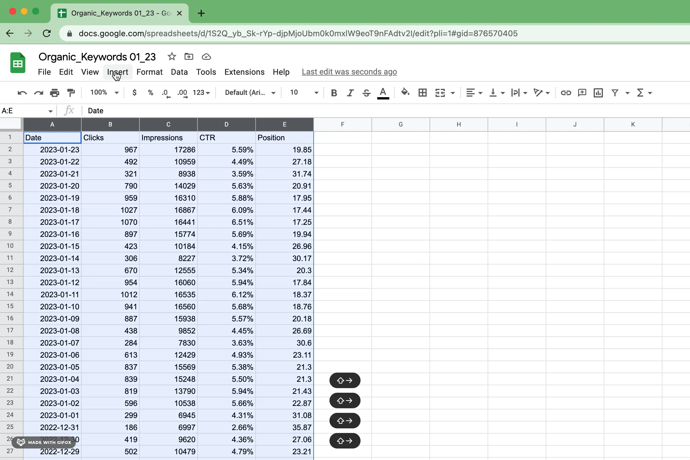
To create your Google Sheets graph, the quickest and simplest way is to open up Google Sheets. Select the information you would like to visualize and follow these easy steps:
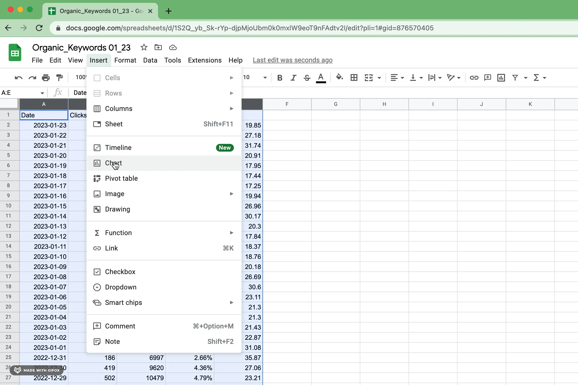
Insert a chart from the menu as shown below. Google Sheets will attempt to interpret your data and generate the perfect chart or graph for you.
At times, it may get very close to what you want; other times though, not so much. The positive side is that none of this matters - you can always adjust and tweak your graph until it looks exactly how you envisioned! In any case, Google Sheets does offer a great starting point for creating amazing graphs with ease.
Google Sheets has an extensive range of chart and graph types to help you communicate your data more effectively. For further information on utilizing each visualization type, take a look at the Google Support page for helpful descriptions and tips.
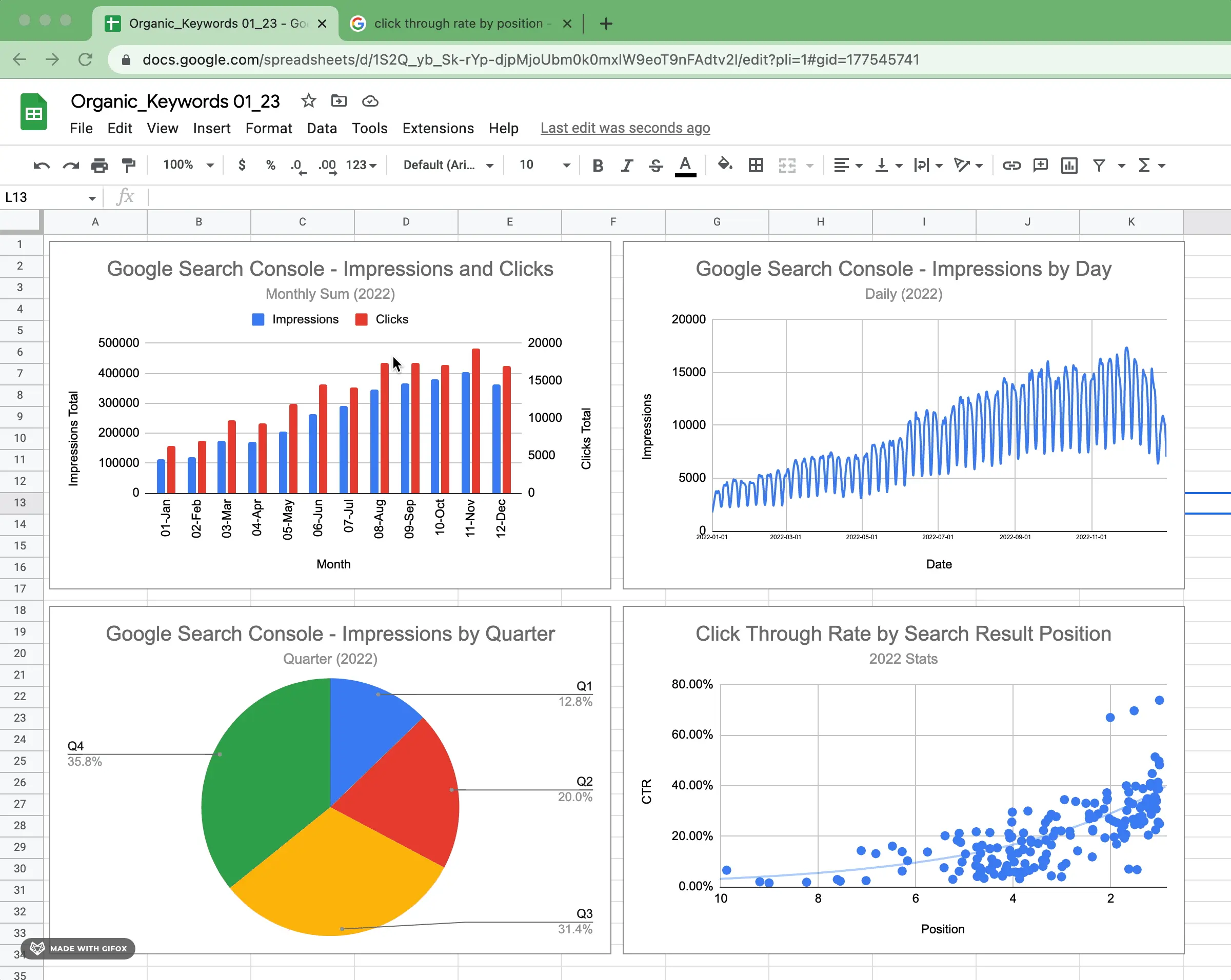
If you're looking for more information on configuring basic graphs types, you can find those in sections on bar charts, stacked bar charts, column charts, stacked column charts, line charts, pie charts, scatterplots and area charts from our guide.
Depending on the chart type, the configuration settings vary quite significantly. The main areas of configuration across the majority of chart types are as follows:
Adding titles, subtitles, x-axis titles, and y-axis titles to a chart is extremely important in helping the audience understand the information quickly and accurately. Titles are key in providing context to the overall message of the data being presented. It adds clarity to the story that can otherwise be overlooked or misinterpreted if left out.

Avoid titles that lead to confusion or misinterpretation of the information being shown, as they are meant to provide context and clarity. Without this context, viewers may not understand the message that the chart is trying to convey and as such, can come away confused.
Axes and series values are arguably the essential configuration element in a data visualization. They allow you to plot your data points along two axes, allowing you to better visualize trends and relationships between the different variables. By plotting against both the x-axis and y-axis, users can easily identify patterns that may otherwise be difficult to understand from a table or written content.

Each chart type will have slightly different requirements. When selecting data and inserting a chart, Google attempts to categorize these values for you. This can help you understand how you can modify the configuration to meet your needs.
Data labels can be important to use in data visualizations because they tell you what each data point is. With them, it is easier to understand the trends and relationships between different variables. Data labels help people understand the story that the chart is trying to show.
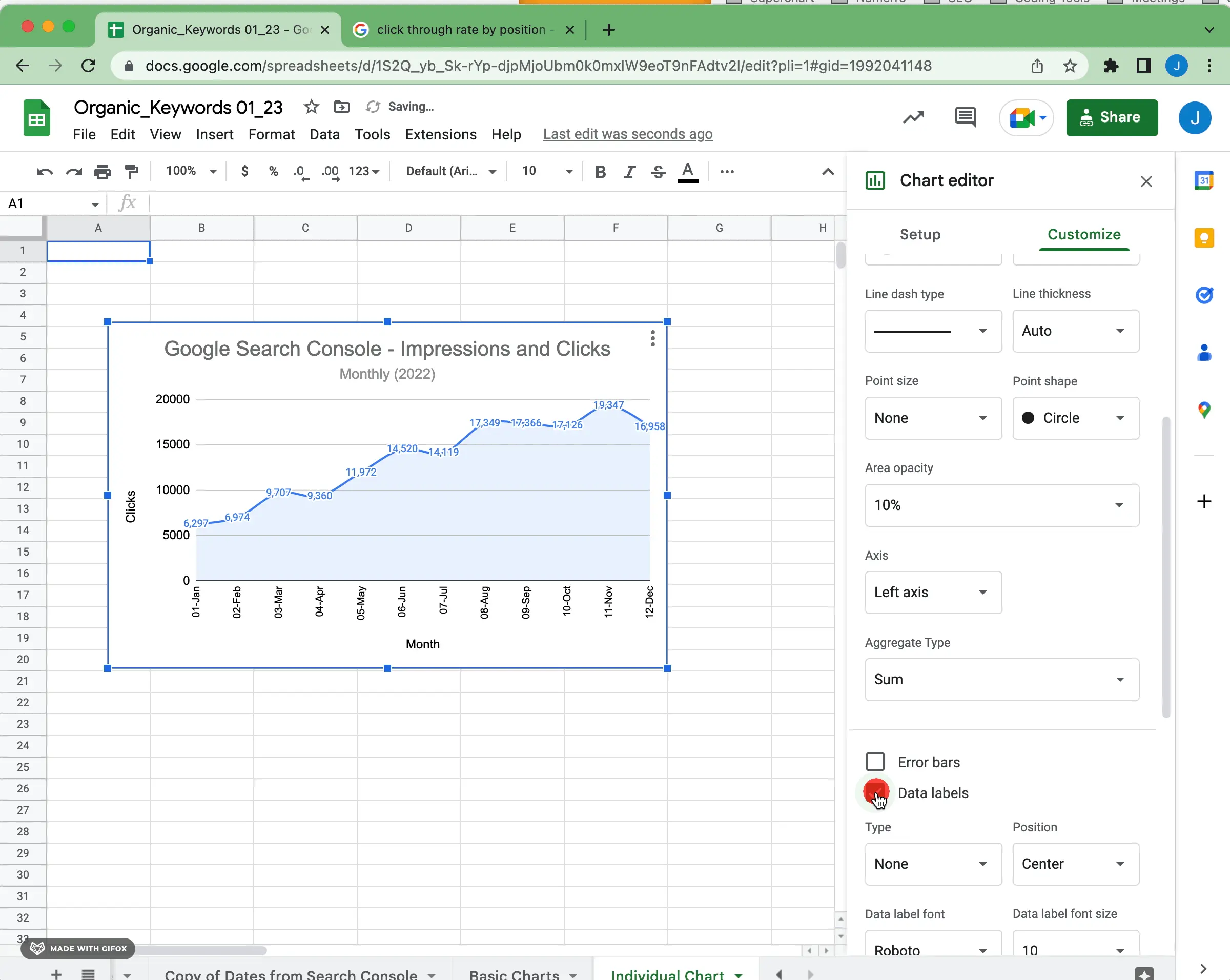
Sometimes you might not want to use data labels in a data visualization. Avoid data labels that make the chart look cluttered or hard to read. So if your chart is complicated or has too much detail, it might be better to leave out the data labels entirely.
Legends are an important part of multi-series data visualization, as they help to explain the meaning behind the chart or graph. Legends can be used to provide context for each element of the chart, allowing viewers to quickly and easily understand what each symbol or color means. Legends also act as a quick reference point for viewers to refer back to as they consume the information.

Whether you are creating a line graph or an area chart, the scale of the graph can be important. The scale should represent the range of data and allow viewers to see all of your data points clearly. If the scale is too large or too small, it could distort the perception of trends in the plot. Take some time to make sure that
The use of color in data visualization is a very powerful tool. It can help to convey meaning, as well as draw attention to key details, patterns, and relationships within the data. When used correctly, it can be a great way to simplify huge amounts of complicated data into something more engaging and memorable.
Depending on the use case, it can also be important to have a consistent color palette between your data visualization and your brand/website. Having the same colors across data visualizations helps to create a unified look and feel that ties together all of the visuals on a website or within an organization’s brand. You can also use color to represent the same category but across different visualizations.
Once you have the configuration of your chart and all of the details honed to your liking, it's time to share it with the world.
The most common way to share a graph in Google Sheets is to share the Sheet. Google makes that super simple. It also ensures that you'll be looking at or working with the same version.
Exporting a graph created in Google Sheets as an image file is a straightforward process as well. Click on the graph to select it and then click “Download” in the top right menu.
Google Sheets also has embed options. You can even drop a referenced graph into Google Slides and refresh the data from Slides.
Google Sheets is a very powerful tool. Getting the hang of graphing in Google Sheets takes some practice. If you're new to the functionality, be sure to check out our guide on graphing and charting in Google Sheets for newbies. If you want to include beautiful Airtable visualizations or charts on Google Sheets that are designed consistently, be sure to try Superchart for free.


