

Creating a graph or chart in Google Sheets is a simple process that involves gathering the data you want to display, inputting it into the appropriate columns and rows, and then using the built-in chart functions to visualize your data. Getting started is a breeze, but you'll quickly realize the depth of configuration and visualization options. It can be overwhelming. If you're just getting started with graphs or charts in Google Sheets, this guide should give you all of the tools to start on a good foot.
It should be noted, between Looker, Looker Studio, and all of the capabilities of the Google Cloud Platform, Google is a master of modern-day data visualization with much to offer. Even within just the Google Sheets universe, we'll only touch on a fraction of the options, extensions, add-ons, and capabilities. Regardless, finding direction in this vast universe can be difficult. This guide will get you started with the basics.
Select the Data to Visualize in Google Sheets
To start, open up your Google Sheets spreadsheet and select the data you would like to include in your graph or chart. There are other ways to kick into data visualization creation, but this is by far the easiest. Follow these basic steps:
1) Select the Data to Visualize in Google Sheets
2) Insert a Chart
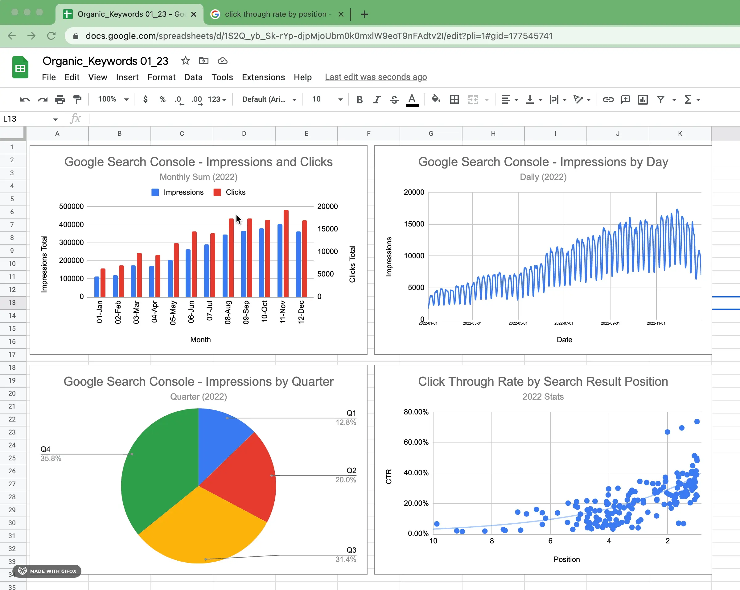
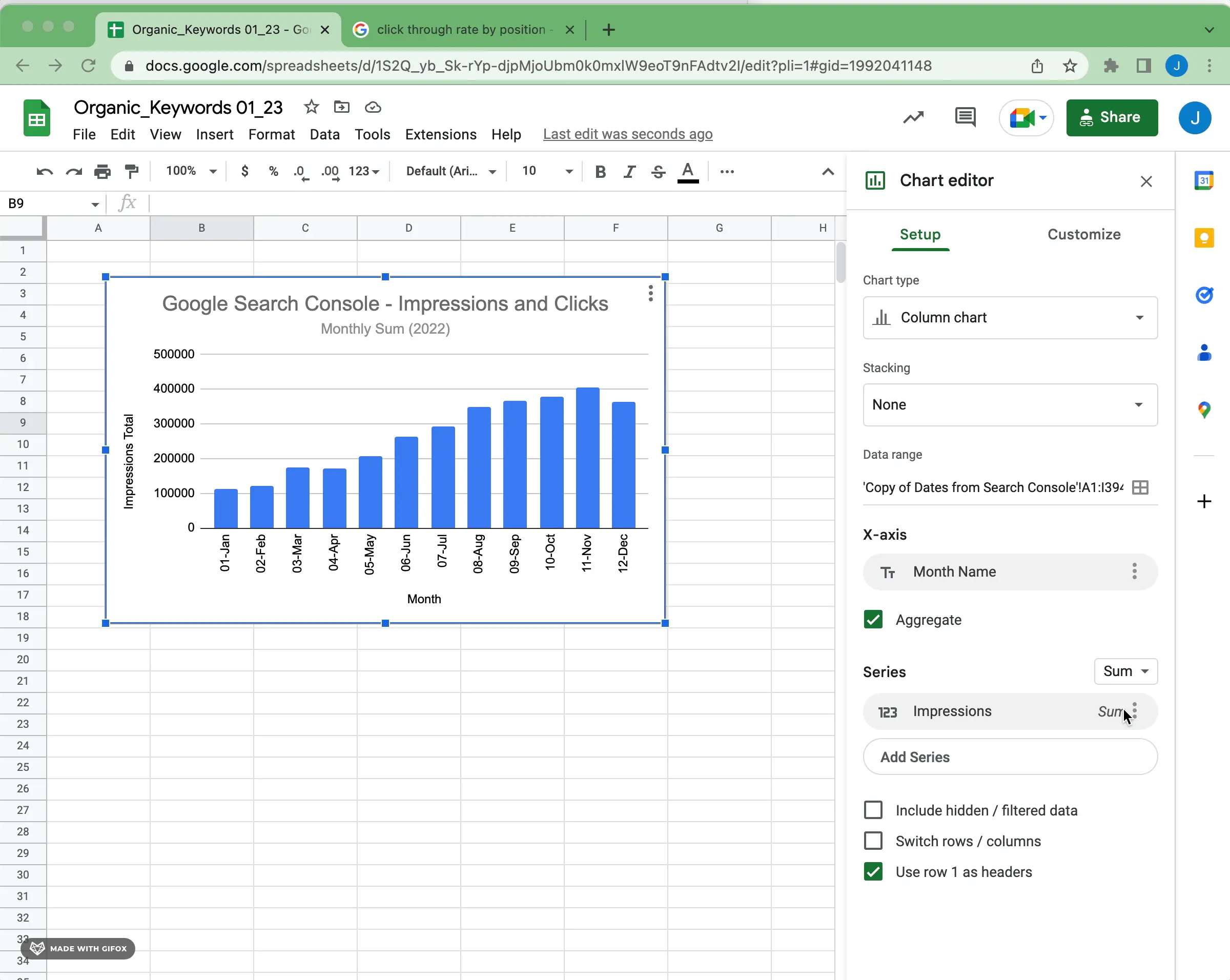
Google sheets will do its best to interpret the data and insert the appropriate chart. Oftentimes, it's very close to the desired result; Other times, it's pretty much nonsense. The good news is, it doesn't matter either way. You'll be able to edit and configure your chart to the desired result, but this gets you started.
For instance, because of some of the data formatting, this Google Search Console data defaults to a relatively illegible visualization:
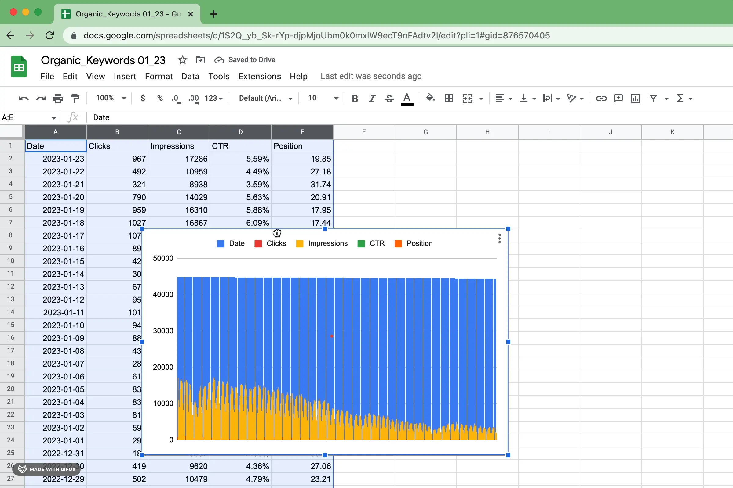
We'll adjust this into a beautiful visualization by choosing the right type of chart and then configuring the Google Sheets Chart to specification.
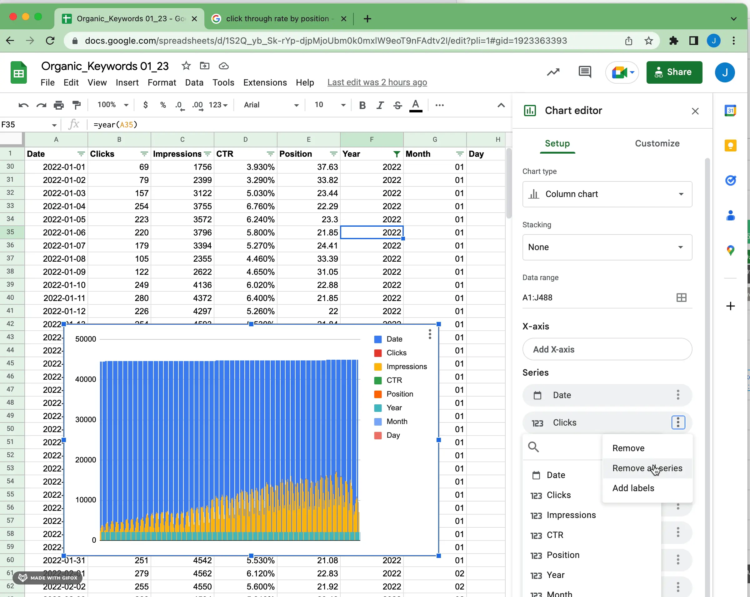
One easy way to clear out the current config without losing the 'good stuff' (i.e. range selection, chart type, defaults, etc.) is to clear the series values and configuration:
Choose the Type of Chart in Google Sheets
Google Sheets offers a variety of chart and graph types for your data visualization needs. Google gives a basic description and some help on utilizing the different visualization types on the Google Support page.
Let's discuss the most commonly used chart and graph types first:
Bar Chart or Column Chart in Google Sheets
The most commonly used type of graph is the bar chart, which is used to compare categories or groups within a data set. Bar charts are often used to track how different variables interact with one another, such as changes in sales over time. They can be configured in a variety of ways, including horizontal or vertical orientation, color coding, and multiple levels of data analysis.
A bar chart has the data shown as bars that go side-to-side (horizontal), while a column chart has the data shown as columns that go up and down (vertical).

Line Chart in Google Sheets
Line graphs are also popular among data analysts. They show how values change over time and how trends emerge or decline, making it easier to identify patterns within the data set. Line graphs are especially useful when tracking multiple values that may be related to one another in some way, such as inventory levels versus customer purchases.

Pie Charts in Google Sheets
Pie charts are perfect for analyzing how different parts of a whole relate to each other – for example how various expenses make up total costs for a business or how different segments of customers contribute to overall sales. Pie charts can be configured with different angles and sizes to help make the relationships between the parts more visible and easier to interpret.

Scatter Plots in Google Sheets
Scatter plots allow users to easily spot correlations between two sets of data points by plotting them on an x-y coordinate plane. These graphs can help users determine how certain events affect other values within the data set, making it easier to identify outliers and weak spots in their analysis.

Area Charts in Google Sheets
Area charts are similar to line graphs but also include area shading under each line which makes it easy to compare different sections within the same graph. This type of chart is often used when comparing multiple datasets at once since it is easy to see how each dataset relates relative to the others on the chart at any given time.

Other Chart Types in Google Sheets
There are so many additional visualization types and configurations of those types. Here are a few worth noting, but once you're familiar with the basic types you can venture into more advanced visualizations.
Stacked Bar and Stacked Column Charts in Google Sheets
Variations of a standard bar or column chart, the stacked variations provide a visual representation of how different data values combine to create a total. These charts show how each value contributes to the whole, which can help viewers understand how various components interact within the dataset. Stacked bar and column charts are often used when comparing multiple datasets at once or when analyzing how different categorizations contribute to a whole over time.
Combo Charts
Google Sheets also offers Combo charts, which are hybrid graphs that combine multiple chart types for greater visualization. For example, you can create a combo chart of area and line charts to better show how two values interact with each other over time. It's fairly common to have a combo column and line chart.
Geo (Maps)
A Geo Chart provides a geographical representation of data points on maps. If your data contains geographical information, this can be a real crowd-pleaser. Plotting data by geography can be tough to do mentally (or in your mind's eye), so it can be very helpful to see it on a map.
Histograms
Histogram Charts in Google Sheets are data visualizations that show how different values within a dataset are distributed over time. They can be set up with various parameters, such as horizontal or vertical orientation, color coding, and multiple levels of analysis. Histograms provide an easy way to compare the distribution of different sets of data in a single graph while also displaying how individual parts interact with each other to create the overall picture.
Waterfall
A waterfall chart in Google Sheets is a special type of chart that depicts how different values within a dataset contribute to the total. It consists of bars that are either raised or lowered depending on how much each value contributes, with the result being a visual representation of how each value affects the total. Waterfall charts are useful for analyzing how changes to individual parts affect the overall sum and can be used to analyze data such as costs, income, profits, and losses over time.
Now that we've given an overview, we'll show you a few things that will get you up and running quickly with the basic chart types. We're going to assume you've selected a data set and picked a chart type.
How to Make a Bar Chart in Google Sheets
The most basic Bar Chart has the following elements. In the chart setup, you'll need to start with these basics:
1) Configure Y-Axis and Series
Select the values for your y-axis and series. There are a lot of ways to configure a bar chart, but in general, you'll want categories as y-axis values and labels for your bars. In general, you'll want to use series for aggregate measures or metric values that show the scale of the category.
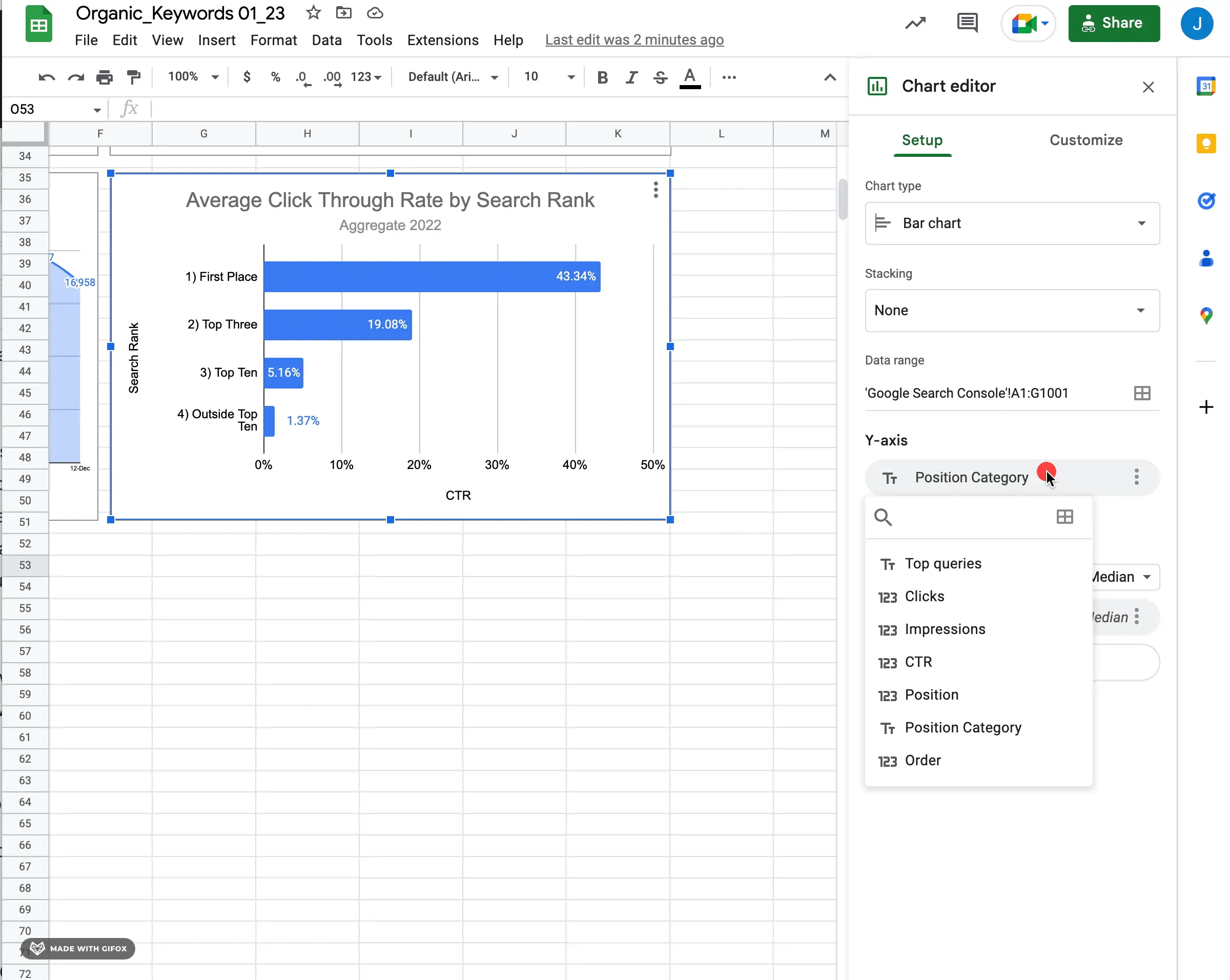
You can also revisit your data range if you need to edit the data source. Be sure to check the method of aggregation on your series (i.e. average, sum, median, etc.). Also, if you edit the setup after further configuration, make sure that things like the title, subtitle, and axis labels still accurately describe the data.
As for chart customization, there are a lot of options. To get you going, here are some of the most important to configure for a bar chart.
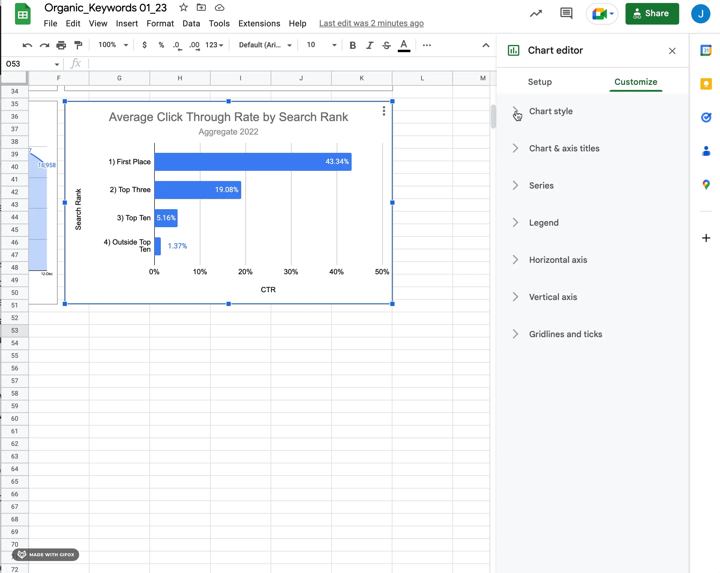
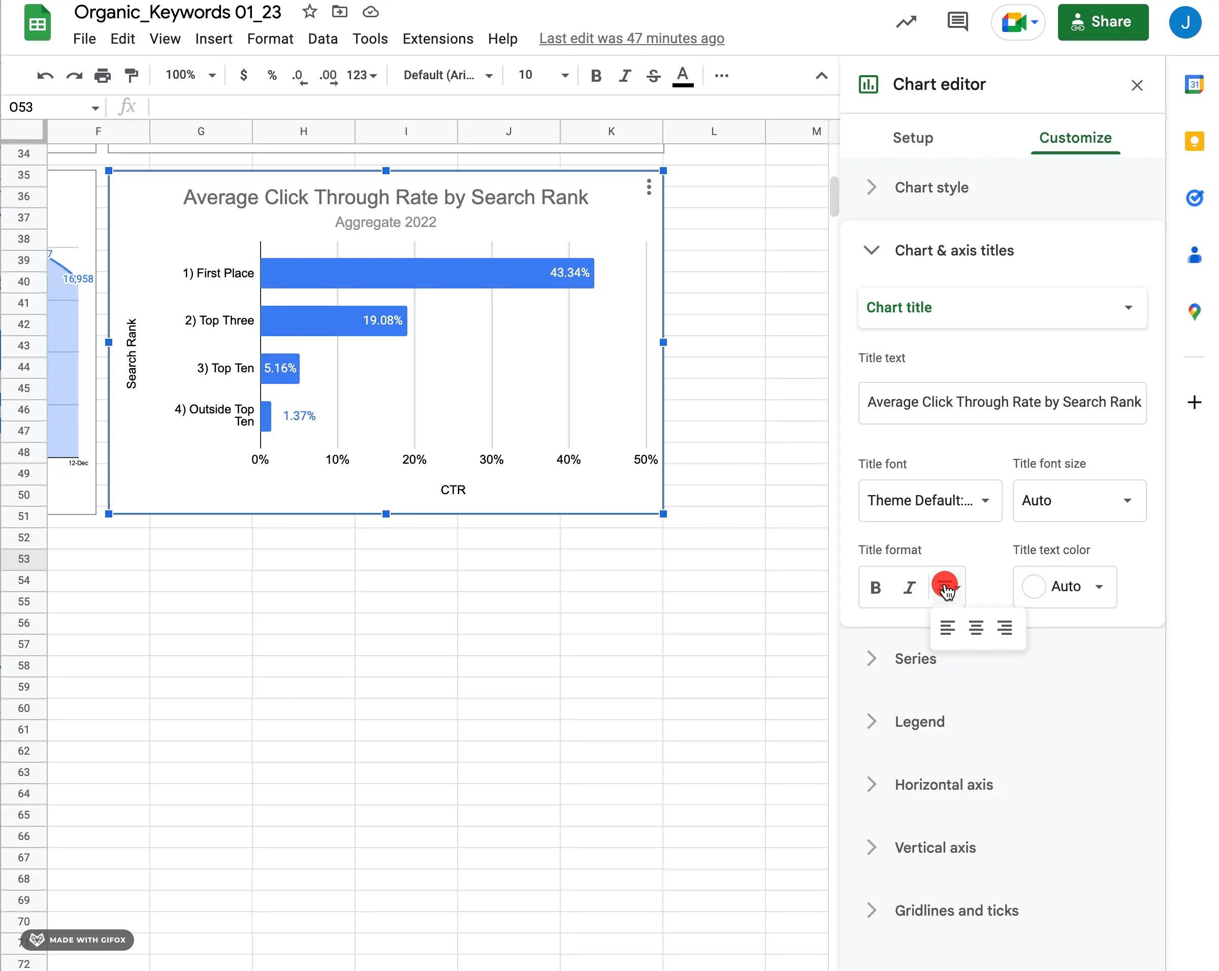
2) Configure Titles
The main title should provide an overview of what the bar chart is depicting and should be easy to understand. The subtitle should provide additional context and detail about how the bar chart was created, such as what type of aggregation was used for the series and how many categories were included in the y-axis. The subtitle can also provide further information on how each category contributes to the total.
For axis titles, you can use descriptive labels that help viewers understand how data values on each axis correspond with each other. For example, if your y-axis is categories and your x-axis values, you could label them “Categories” and “Values” respectively. If more than one metric is being visualized on one axis (e.g. two types of categories), use labels that accurately describe each category.
When setting up titles and axes for your bar chart in Google Sheets, it's important to remember that they should be descriptive yet concise so viewers can quickly orient themselves with your data visualization without getting overwhelmed by too much text or jargon. Use simple language when possible but don't forget to add detail where appropriate so your readers have enough information to interpret your graph correctly! Also maybe just personal preference, but I'm often centering titles as shown.
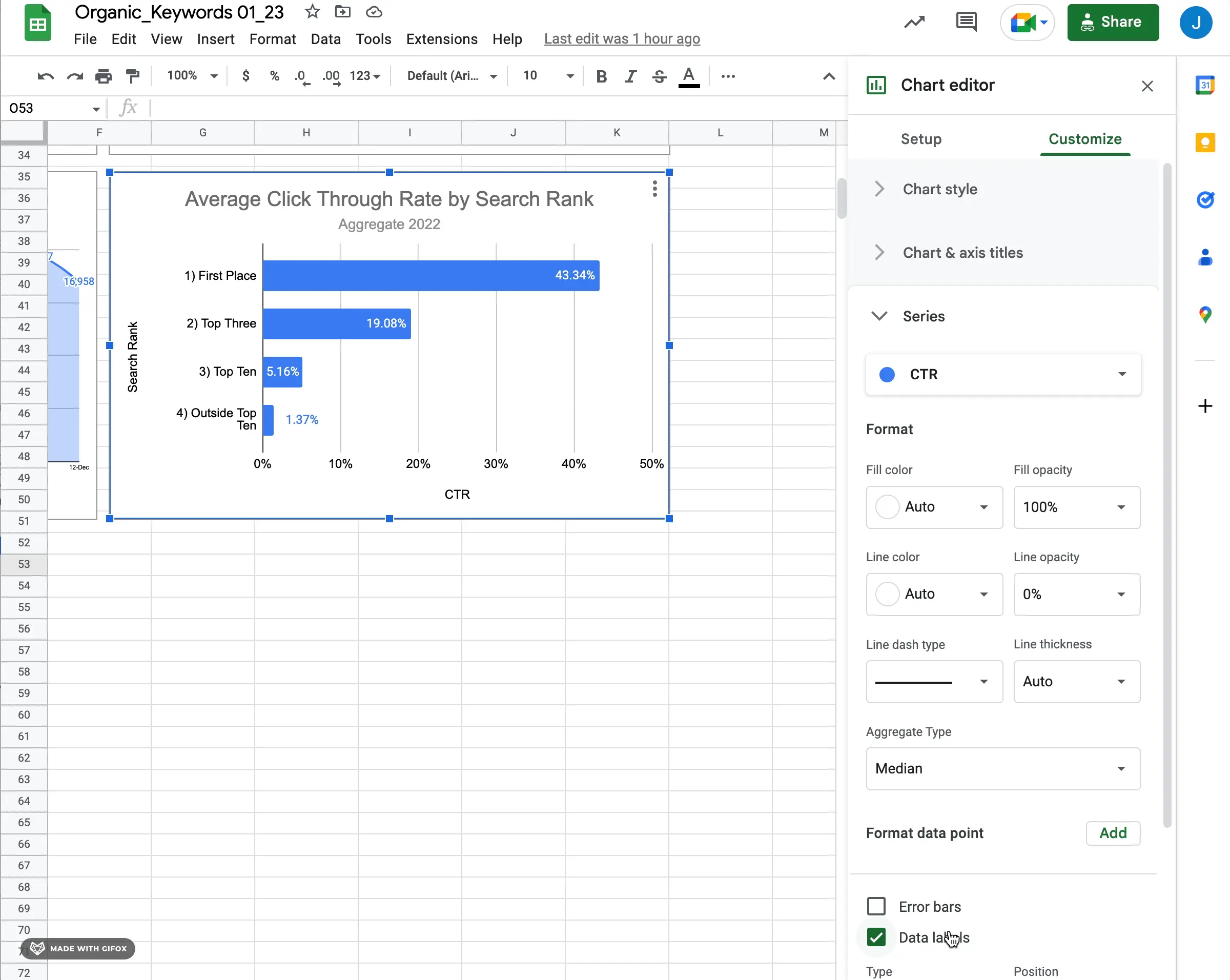
3) Configure Data Labels
Data labels are important for bar charts because they can help viewers quickly understand the numerical value of each bar. Otherwise, depending on the scale of your axis values, the consumer of the visualization needs to go through visual gymnastics to determine the value on their own.
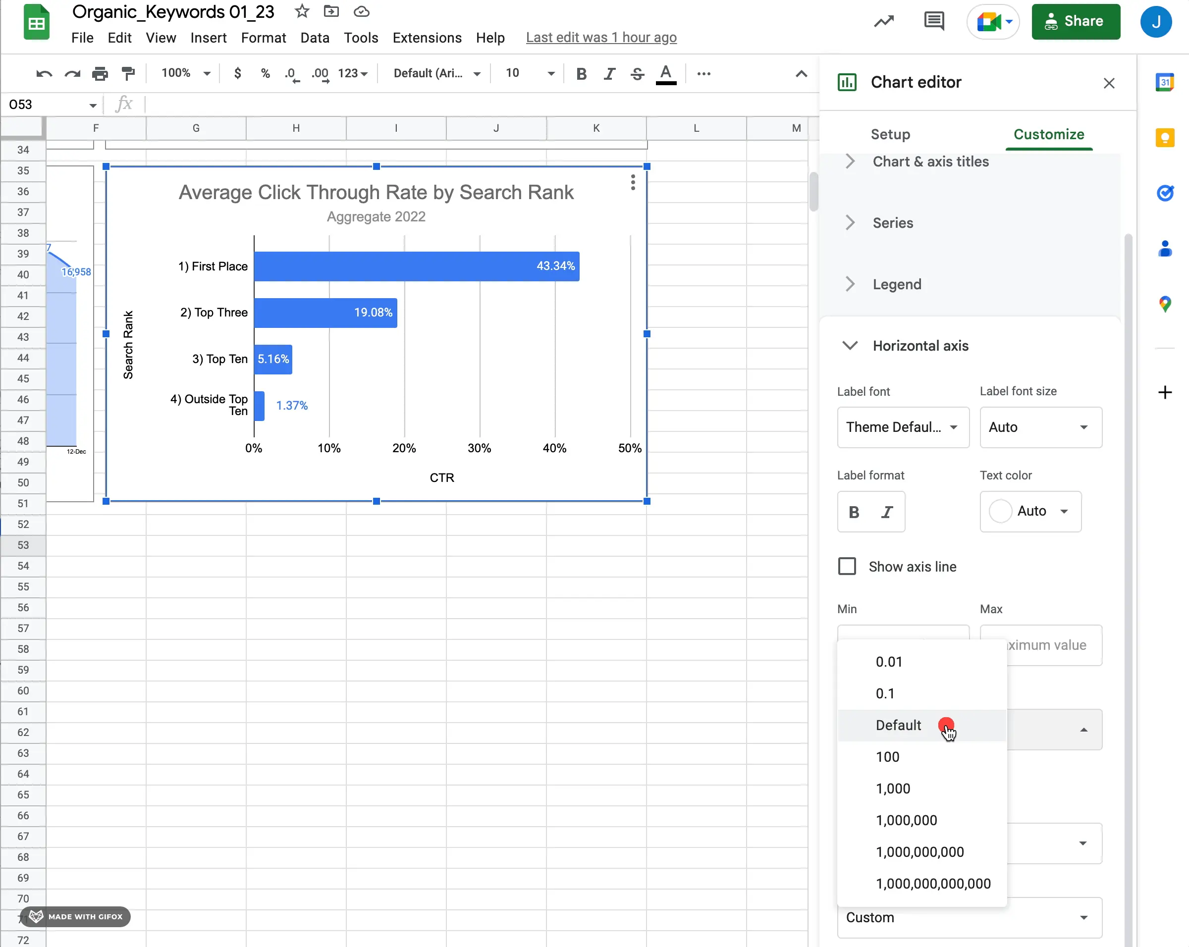
4) Configure Scale Factor (Optional)
The scale factor for a bar chart in Google Sheets is how the range of values is adjusted and visualized on the graph. It's usually set accurately by default, but if you need to adjust how the overall scale factor or modify how the data is displayed, it's important to know where to go to adjust the values.
With the right underlying data, descriptive titles, appropriate data labels, and additional configuration, you're well on your way to a functional and descriptive bar chart data visualization in Google Sheets.
How to Make a Stacked Bar Chart in Google Sheets
Just to take it one step further, you'll likely want to use stacked bars once you start creating a lot of bar charts in Google Sheets. The key to a simple stacked bar is using two series that have the same scale. It's not a requirement that they are on the same scale, but it is certainly a good place to start understanding how the stacked bar chart functions.
After you change to a stacked bar chart type from a regular bar chart, you'll see you can add multiple series to the bar chart configuration.
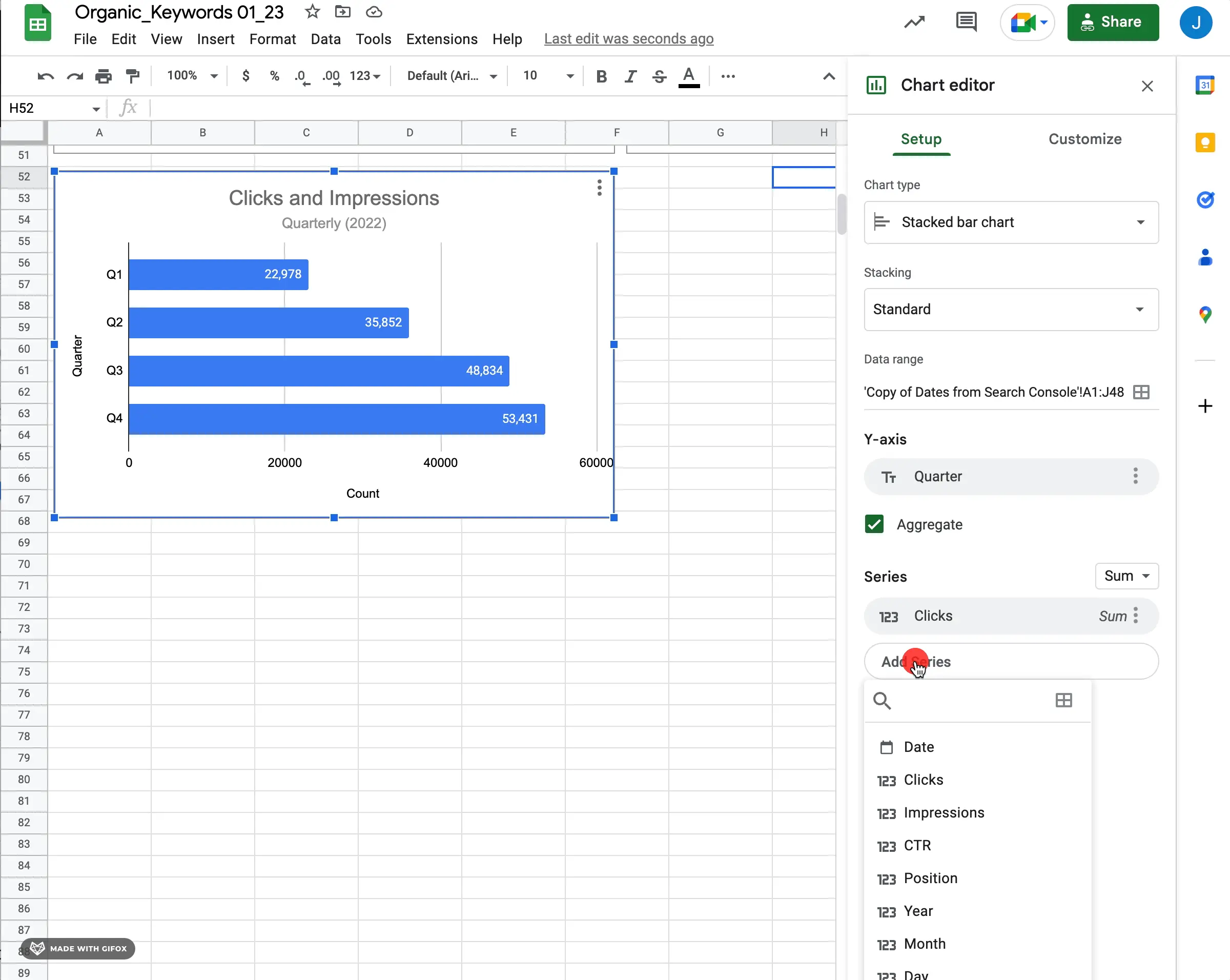
If you choose a second series, you'll see a stacked bar and additional configuration options related to each series. If you don't change the chart type first, you'll see two bars instead of one stacked bar.
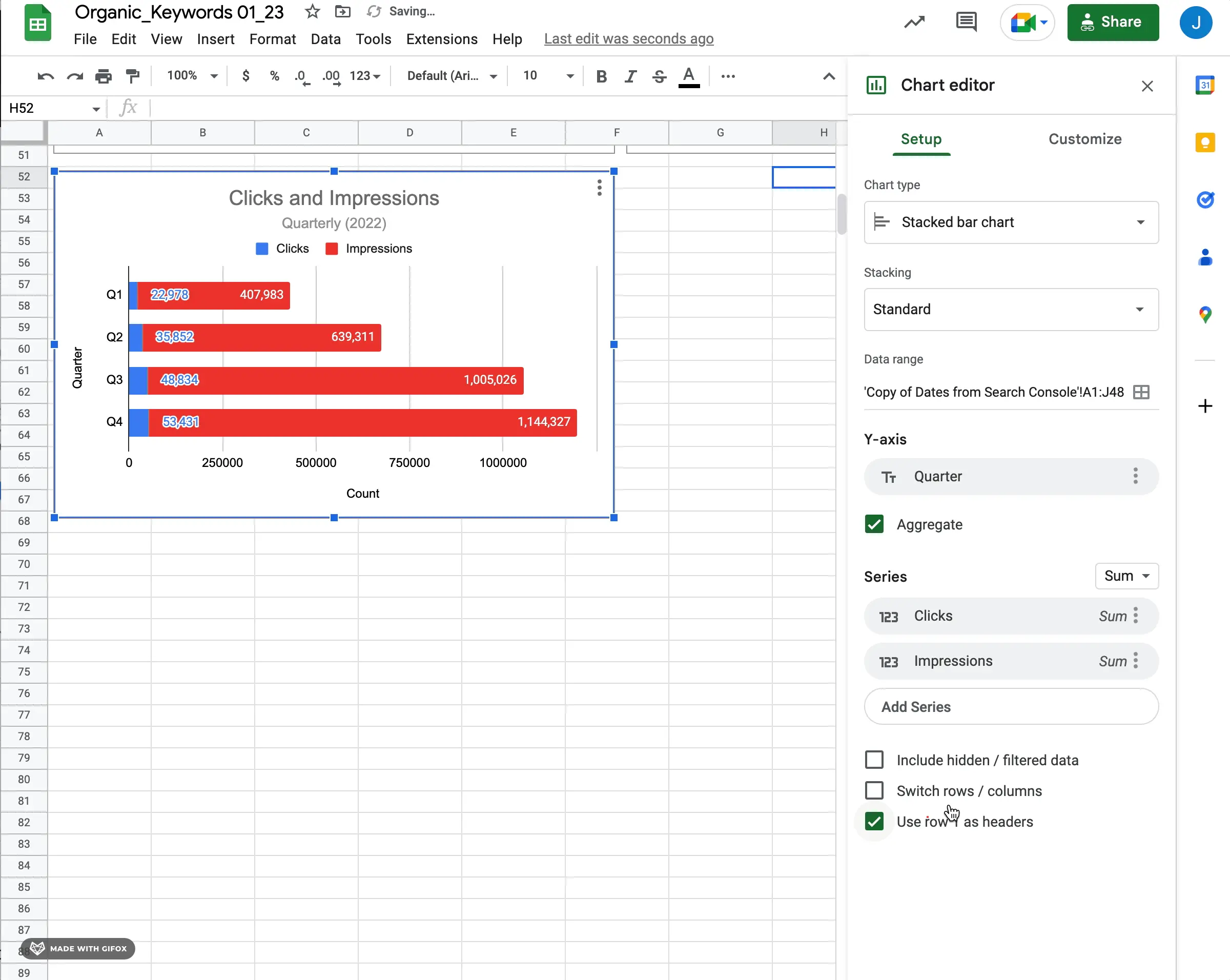
Again, personal preference, but ensuring you have data labels will help the consumer understand the data points presented.
How to Make a Column Chart in Google Sheets
Column charts are very similar to bar charts from a configuration perspective. The basic elements you'll want to get used to configuring for a column chart in Google Sheets are as follows:
1) Configure X-Axis and Series
Select the values for your x-axis and series. There are a lot of ways to configure a column chart, but in general, you'll want categories or a time series as x-axis values and the progression of columns. In general, you'll want to use series for aggregate measures or metric values that determine the size of the column.
Add multiple series if you want to see multiple bars on the same category or time series.
2) Configure Titles
We won't repeat everything that we said about titles on bar charts. Many of the same rules apply as far as best practices. The easy way to think about it is:
- Use titles (and subtitles) often
- Keep them descriptive yet concise
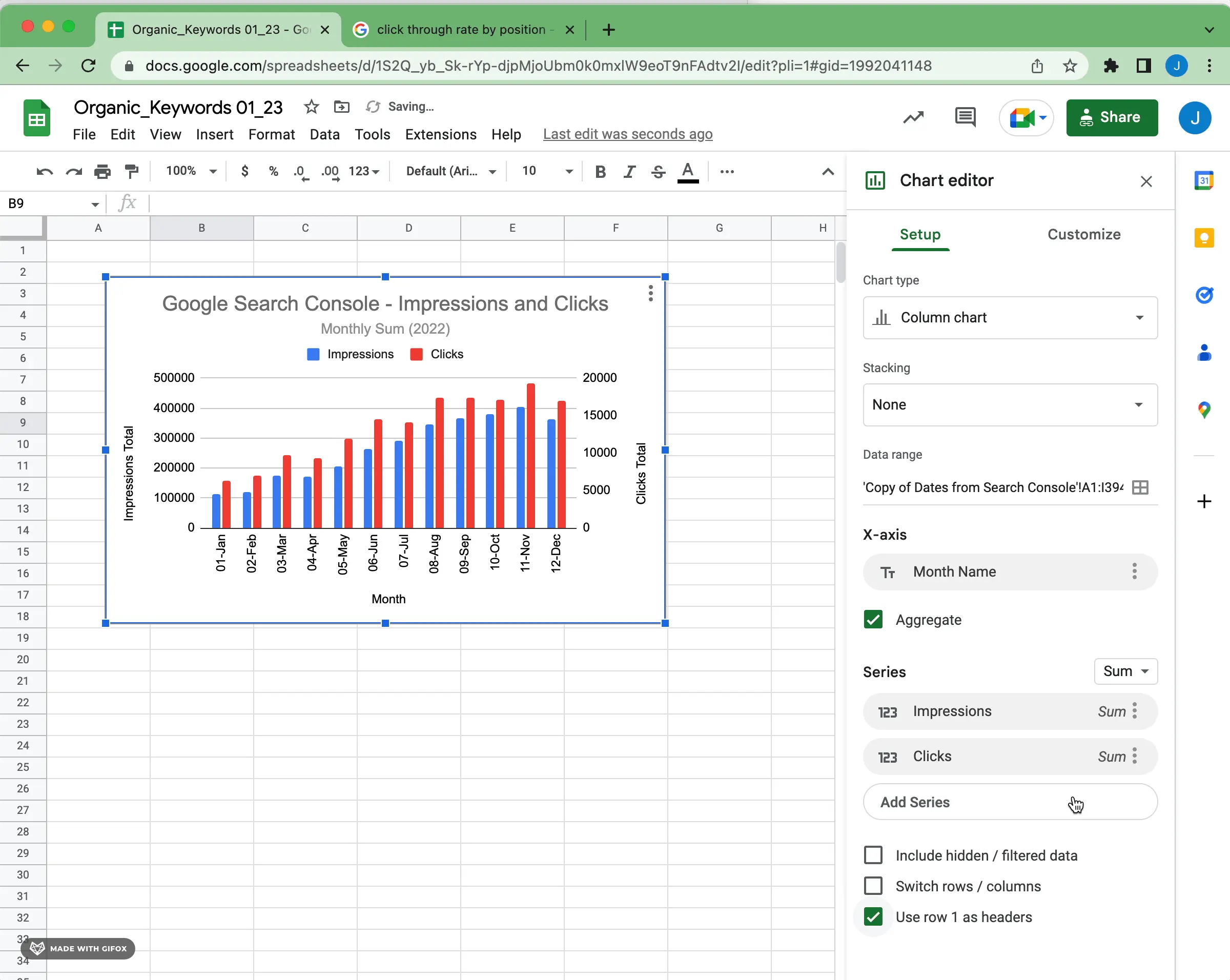
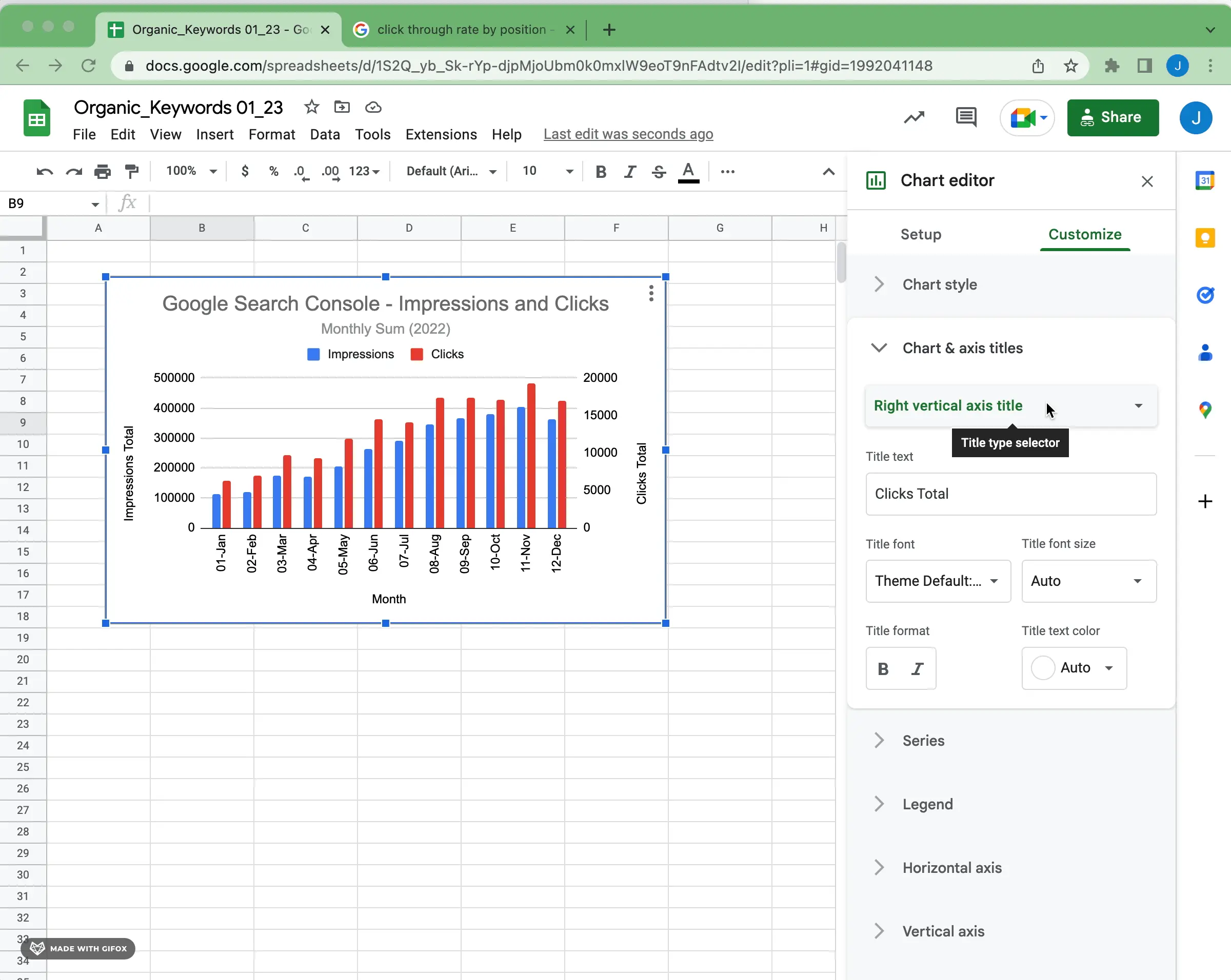
For column chart axis titles specifically, if you have two series values relating to two different ranges, ensure that you use both right and left vertical axis titles as descriptors.
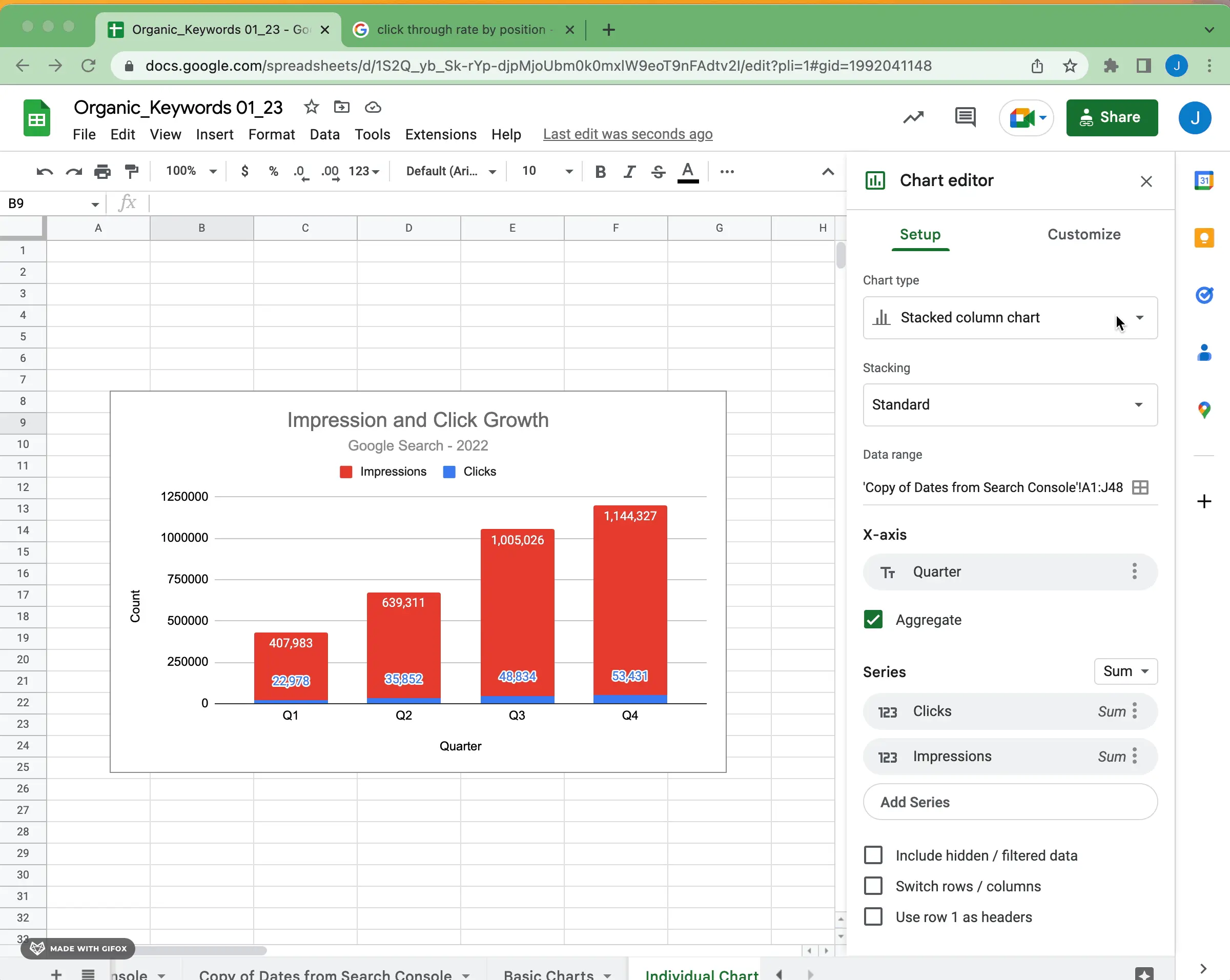
How to Make a Stacked Column Chart in Google Sheets
To make a stacked column chart in Google Sheets, change the chart type to stacked (or 100% stacked). Ensure that the data makes sense visualized as a stacked column. Adding multiple series will give a single bar with stacked values. Once again, data labels are very useful for making the data easily digestible.
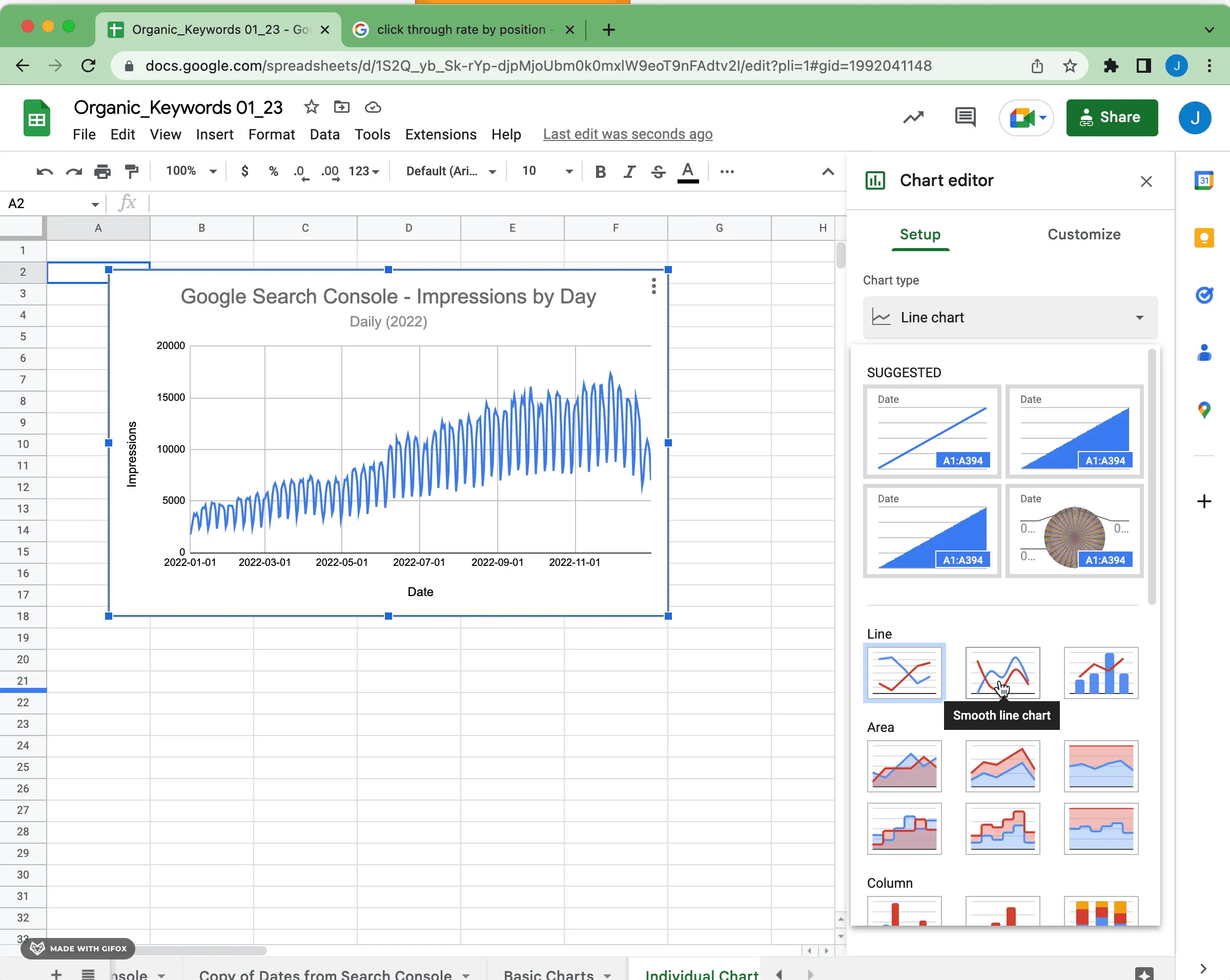
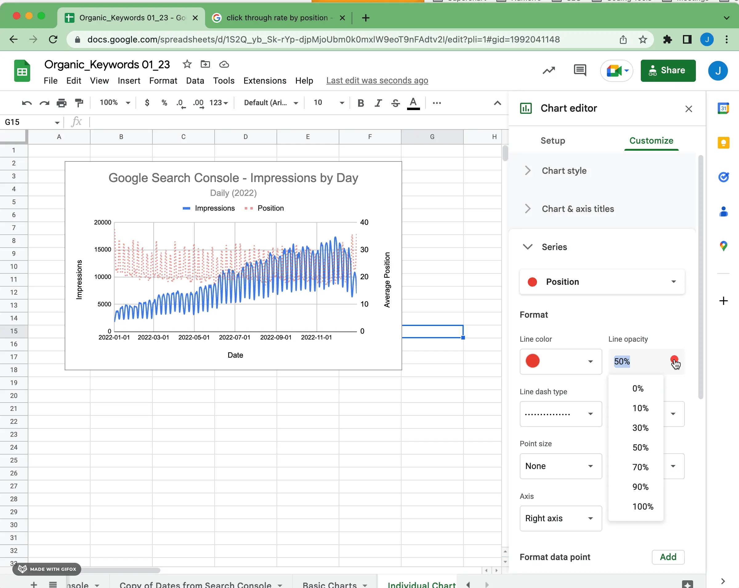
How to Make a Line Chart in Google Sheets
Line charts are a great way to visualize how data changes over time. The basics for configuring a line chart in Google Sheets are as follows:
1) Smooth or Regular Line
A smooth line is a type of line chart that is used to create a more aesthetically pleasing visualization. It removes any minor variation in the data and smoothes out the line, resulting in a more uniform-looking graph. This may be useful when the data points don't vary significantly or if there are too many fluctuations in the data that would make it harder to read the chart.
A regular line, on the other hand, is simply how a line chart typically appears. It does not have any smoothing applied and will display all of the individual points exactly how they are presented in the data table. This can help understand how each point affects the overall trend of your data over time.
When choosing between a smooth line and a regular line for your charts in Google Sheets, it ultimately comes down to how much detail you need from your data. If you want to get an exact picture of how each value affects the overall trend or look closer at how small changes in your data can affect its performance over time, then a regular line would be better suited for this purpose. Conversely, if you just need an overview of how your values have changed over time without worrying about minor variations, then using a smooth line may provide enough information without sacrificing clarity.
2) Configure Titles
Again, the fundamentals:
- Use titles (and subtitles) often
- Keep them descriptive yet concise
For line chart axis titles specifically, if you have two series values relating to two different ranges, ensure that you use both right and left vertical axis titles as descriptors.

2) Configure Series
You can also adjust how individual lines are displayed on your chart by clicking on one of them in the Chart Data section and making adjustments under “Series options”. Here, you can change how a particular line is displayed, including how its color or thickness appears when plotted on your graph.
In particular, the line type and opacity can help differentiate primary vs. secondary information.
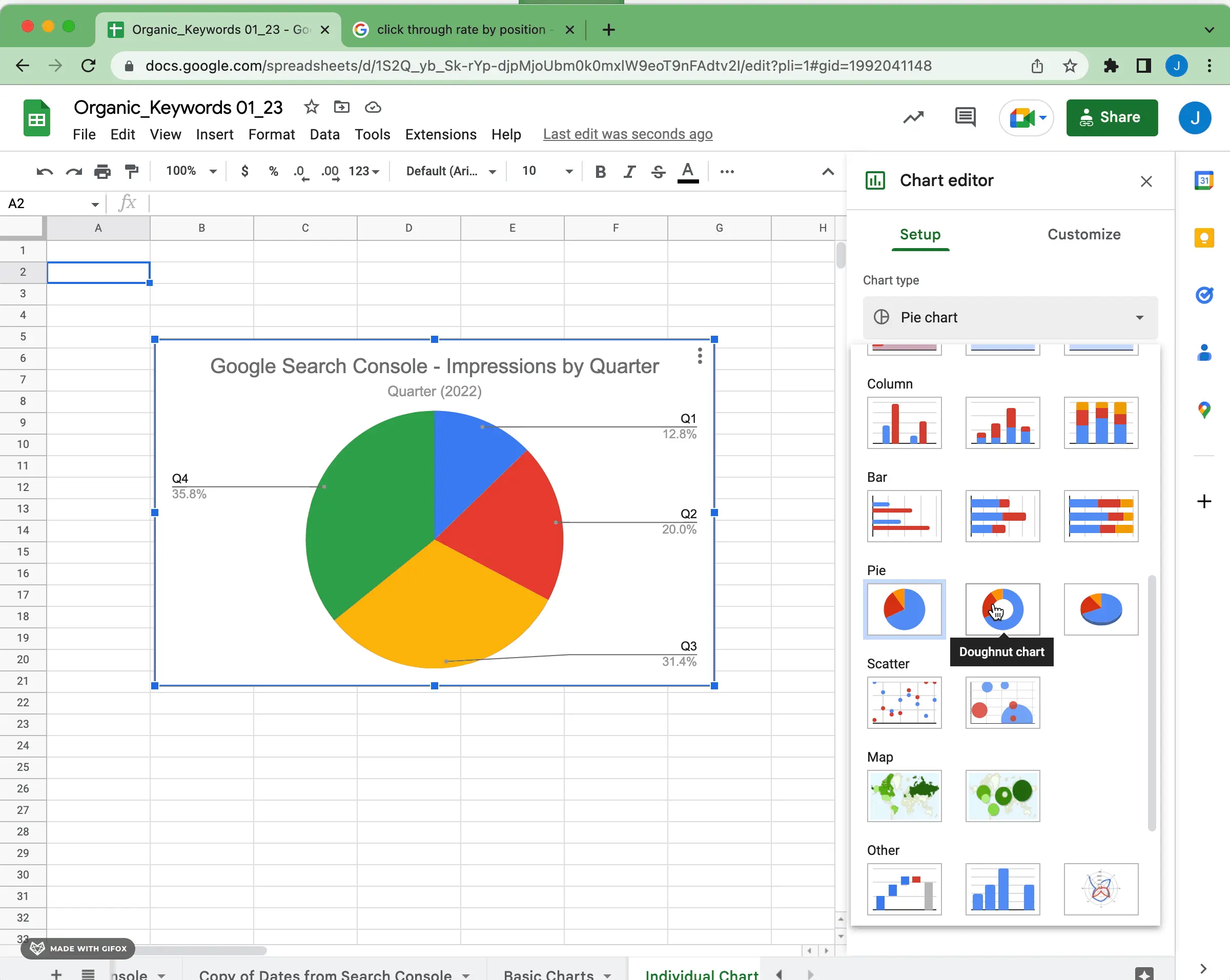
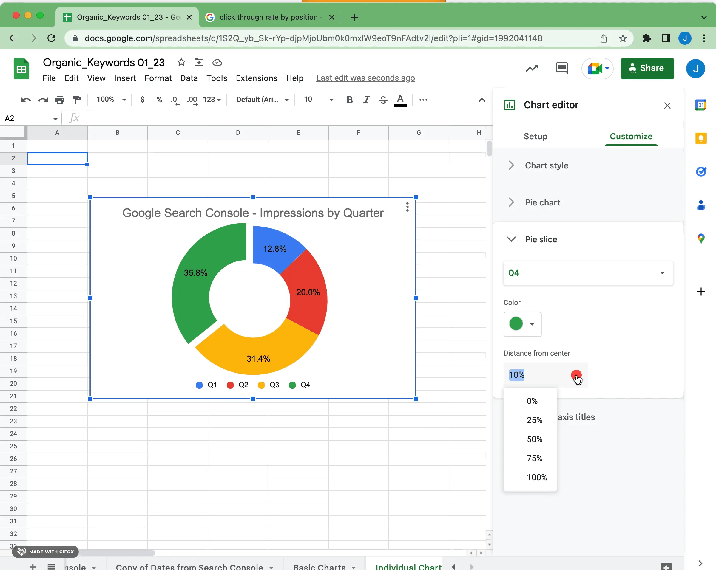
How to Make a Pie Chart in Google Sheets
Pie charts in Google Sheets are a useful tool for visualizing how different parts of a whole contribute to its makeup. Pie charts are especially convenient when it comes to displaying data on small screens as they take up less space than other types of visualizations such as line graphs or bar charts.
When creating pie charts in Google Sheets, it is important to ensure that none of the categories contain identical values; otherwise, your pie chart will not accurately represent the data set. Additionally, try to avoid having too many categories since this can make it difficult for viewers to interpret what is being shown in the graph.
Make sure to follow these key configuration steps when working with pie charts in Google Sheets:
1) Pie Chart or Doughnut Chart
Pie charts and doughnut charts are two of the most common forms of data visualization. Both present information in a way that is easy to interpret and can help people gain insight into how different parts or components contribute to the whole.
The main difference between a pie chart and a doughnut chart is how they are drawn. A pie chart typically has no space between individual slices, while a doughnut chart has an empty center, creating a donut-like hollow circle shape. This allows for more data points to be visualized within the same space, which is particularly useful when dealing with large datasets.
Another key difference between these two types of charts is how their individual slices are emphasized. Pie charts tend to emphasize individual blocks or segments by how much of the circle each takes up, while doughnut charts emphasize segments relative to how close they appear to one another on the circumference. This makes it easier for viewers to compare values between segments as well as get an overall sense of how various components contribute to the total amount represented in the graph.
In terms of when you should use each type of graph, it really comes down to what you're trying to convey with the data. As mentioned above, if you have a lot of data points and need an efficient way to represent them all in one space then using a doughnut chart may be preferable over a pie chart. On the other hand, if you want your viewers to understand how each segment contributes proportionally (or relatively) to the whole then using a pie chart may be better suited for that purpose.
2) Pie Slice Distance
One simple change you can make to highlight a particular part of the pie is to separate a piece from the whole. Use the pie slice distance from the center and labels to give a different effect on the information.
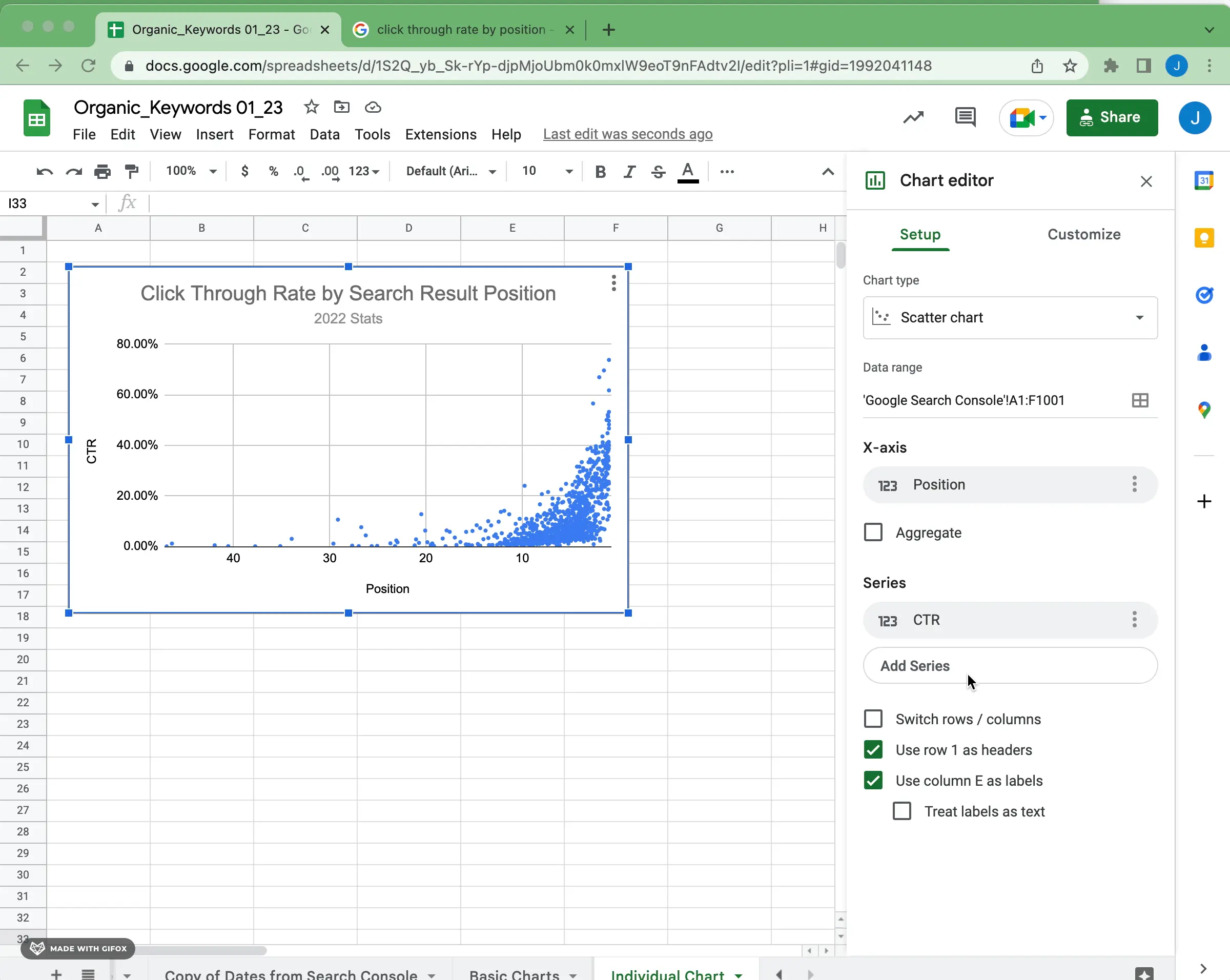
How to Make a Scatter Plot in Google Sheets
Scatter plots in Google Sheets are versatile visualizations that are useful for seeing how two variables interact with each other.
1) Configure X-Axis and Series
For scatter plots, you are generally presenting two numerical measures with one measure on each axis. You can reverse the axis order if you want to flip the data to make the visualization easier to understand.
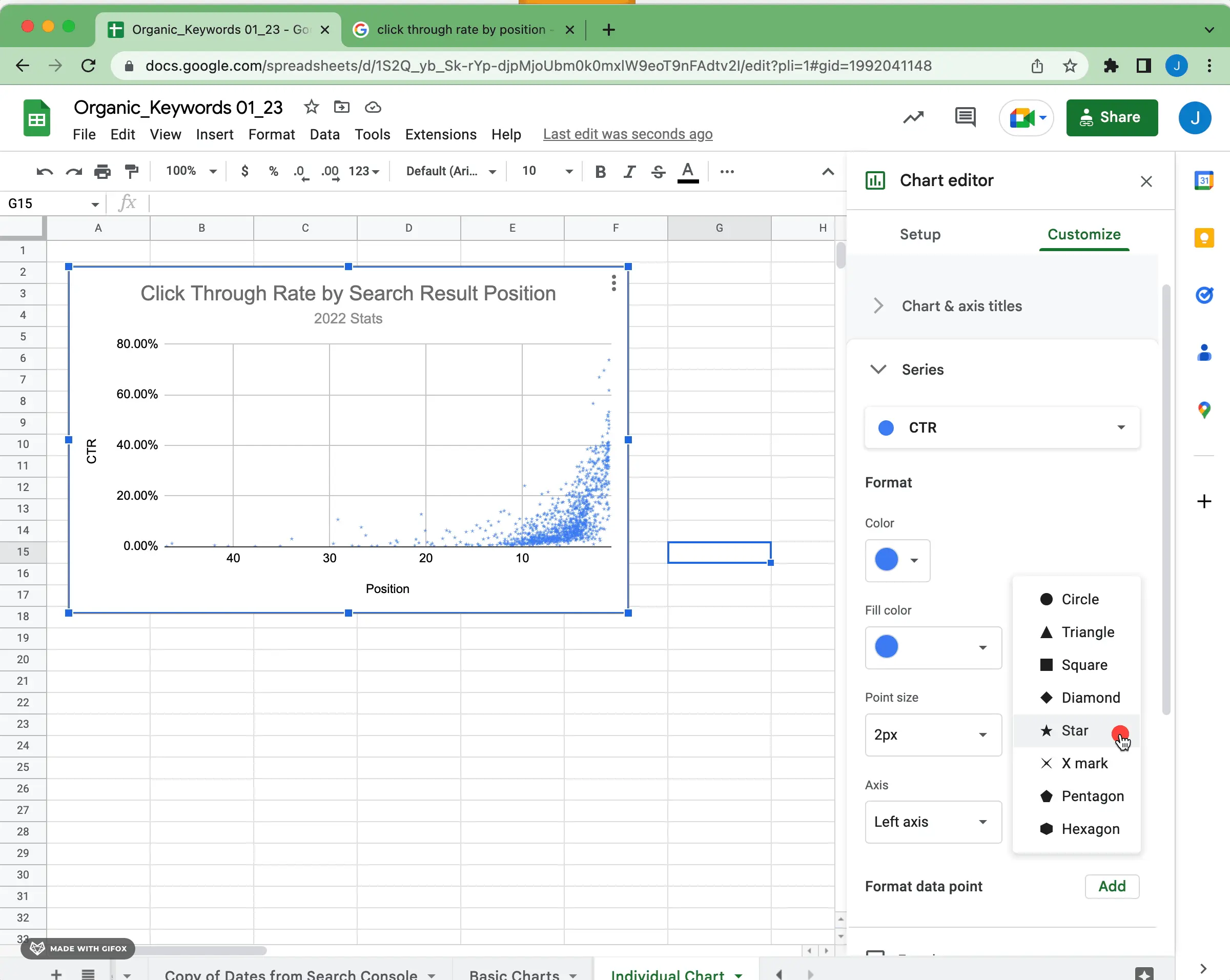
2) Point Shape and Opacity
One of the keys to properly visualizing a scatter plot is choosing the appropriate size, shape, and opacity for each data point. If you have lots of data points, it may need some significant adjustments to make visual sense. For instance, changing the shape to a star and reducing the opacity slightly creates a different visual treatment for the data.
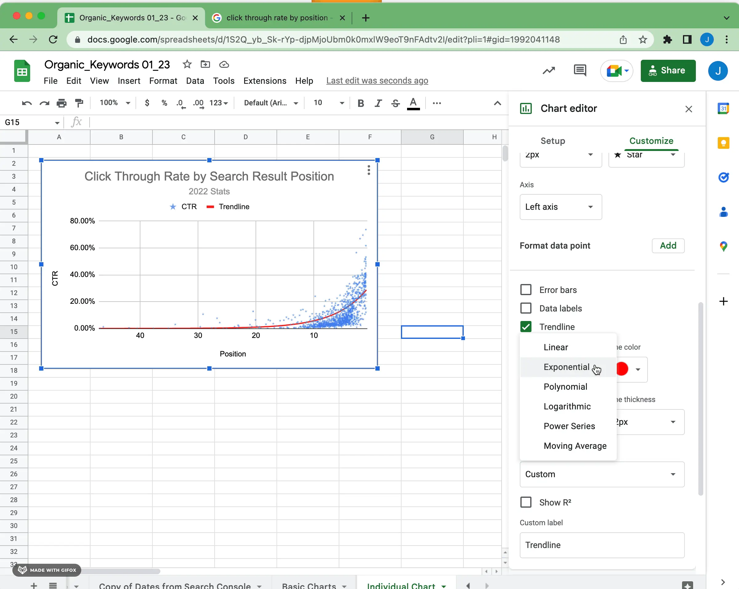
3) Trend Line Configuration
Trend lines in scatter plots can be used to identify how two numerical variables relate to each other. For example, a trend line can help you determine if there is a correlation (positive or negative) between the two variables and how strong that relationship might be. To draw a trend line, begin by selecting the data points and then activating the appropriate tool for your chart type in Google Sheets.
By default, a linear trend line will be generated. This assumes that the data is distributed linearly and is useful for understanding how small changes in one variable might cause small changes in another. However, if you believe that the data follows some other pattern like polynomial or exponential then you can adjust the trend line accordingly.
To make sure that your trend line is accurately representing your data it's important to check for outliers. Data points that are drastically different from the majority of values may indicate an error or an anomaly that could skew the results of your analysis. Additionally, try to make sure that your chart includes enough points so that it reflects how values generally behave rather than how they behaved just at one moment in time; more data points mean more accuracy!
Finally, don't forget to interpret what your trend lines mean! Even though they allow you to visualize how two variables interact with each other it's important to remember how these relationships apply within real-life contexts as well as how they may change over time. This will give you insight into how particular trends can impact outcomes and inform decision-making processes moving forward.
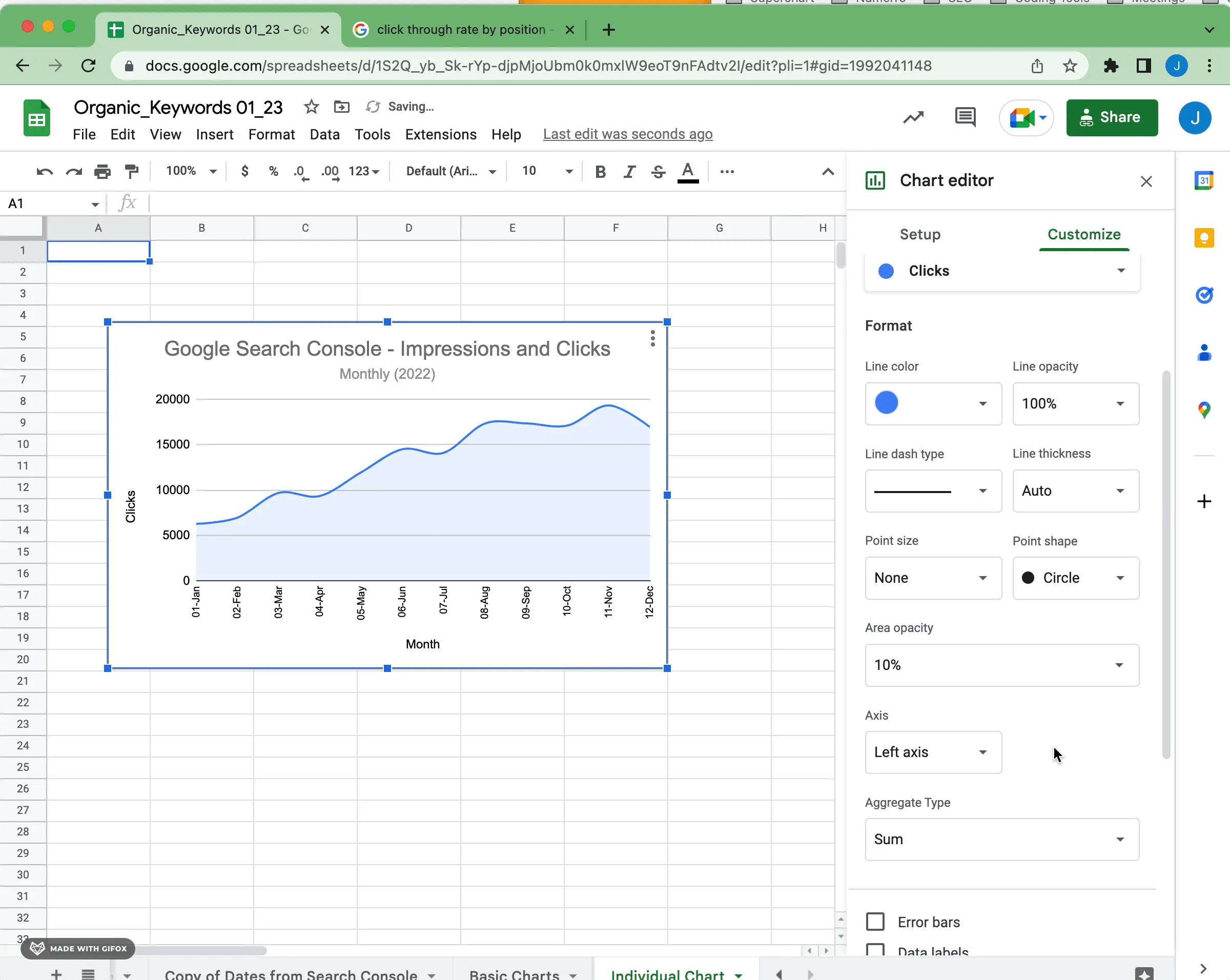
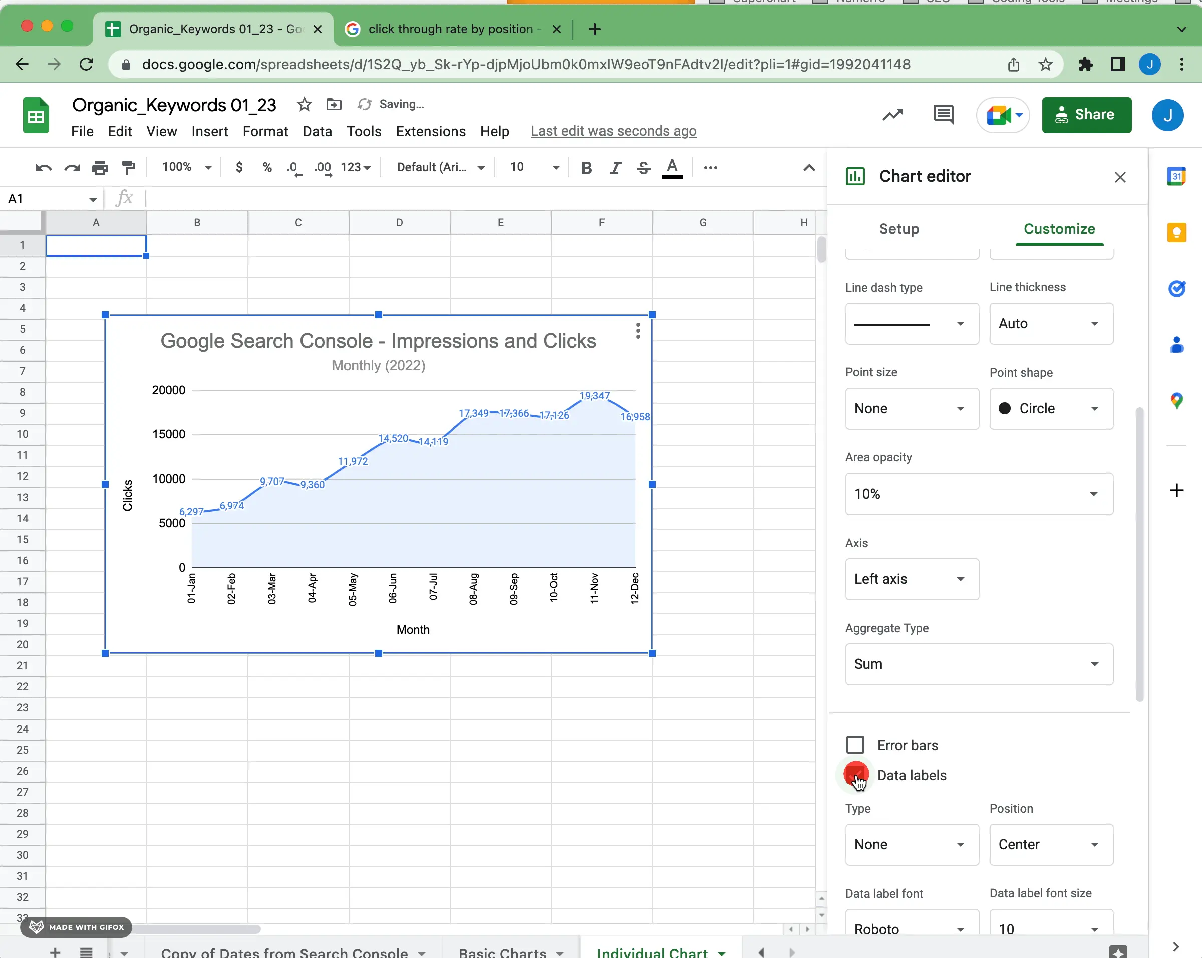
How to Make an Area Chart in Google Sheets
Area charts are a type of line graph that fills the chart with color. It can be used to represent how two numerical variables interact with each other. It can also be used in the same way as a line chart but can give visual gravity to growth or change over time. Ultimately it comes down to what story you're trying to tell using your data and how best you can visually communicate that story.
Here are some important configuration steps to focus on when creating an area chart in Google Sheets:
1) Smooth or Regular Area Chart
Once again, you need to choose whether or not to keep regular, linear line connections or smooth those connections out. Similar to a line chart, this decision depends a lot on the type and amount of data you're visualizing.
2) Area Opacity
This is mostly preference, but if you have multiple series values on your area chart it can really matter. Opacity will determine the density of the shading below your line(s). A simple change can have a dramatic visual effect.
3) Data Labels
Data labels are important to include on an area chart because they provide the necessary context for interpretation. Especially with line smoothing and the visual smoothing of the area fill, it can be hard to understand where each inflection or key metric lands on the scale. Data labels also help drive home increases or decreases over time with call-outs.
In Summary
We've only scratched the service of the charting and configuration options available in Google Sheets. We hope this helps get you started in the right direction. You can find TONS of examples of charts in the Google Docs help for sheets. Each chart type has a few examples that allow you to preview the chart and copy sample data to mess around with and learn on your own.
If you're building visualizations from different data sources like Airtable, Google Sheets, or Notion. be sure to try out the free version of Superchart. We're on a mission to make data visualization easier and more approachable for everyone, regardless of technical skill.


