
Scatter plots plot two sets of data points on an x-y coordinate plane, making it easy for users to identify correlations. They can help users understand how events influence other values within the dataset, which can reveal outliers and weak spots in their analysis.
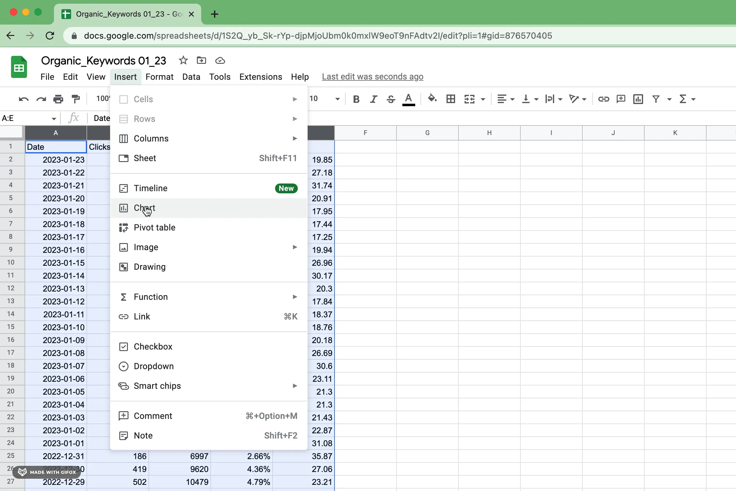
Select the data and insert a chart into Google Sheets, similar to the picture below. You can also select the data and right-click to insert a chart.
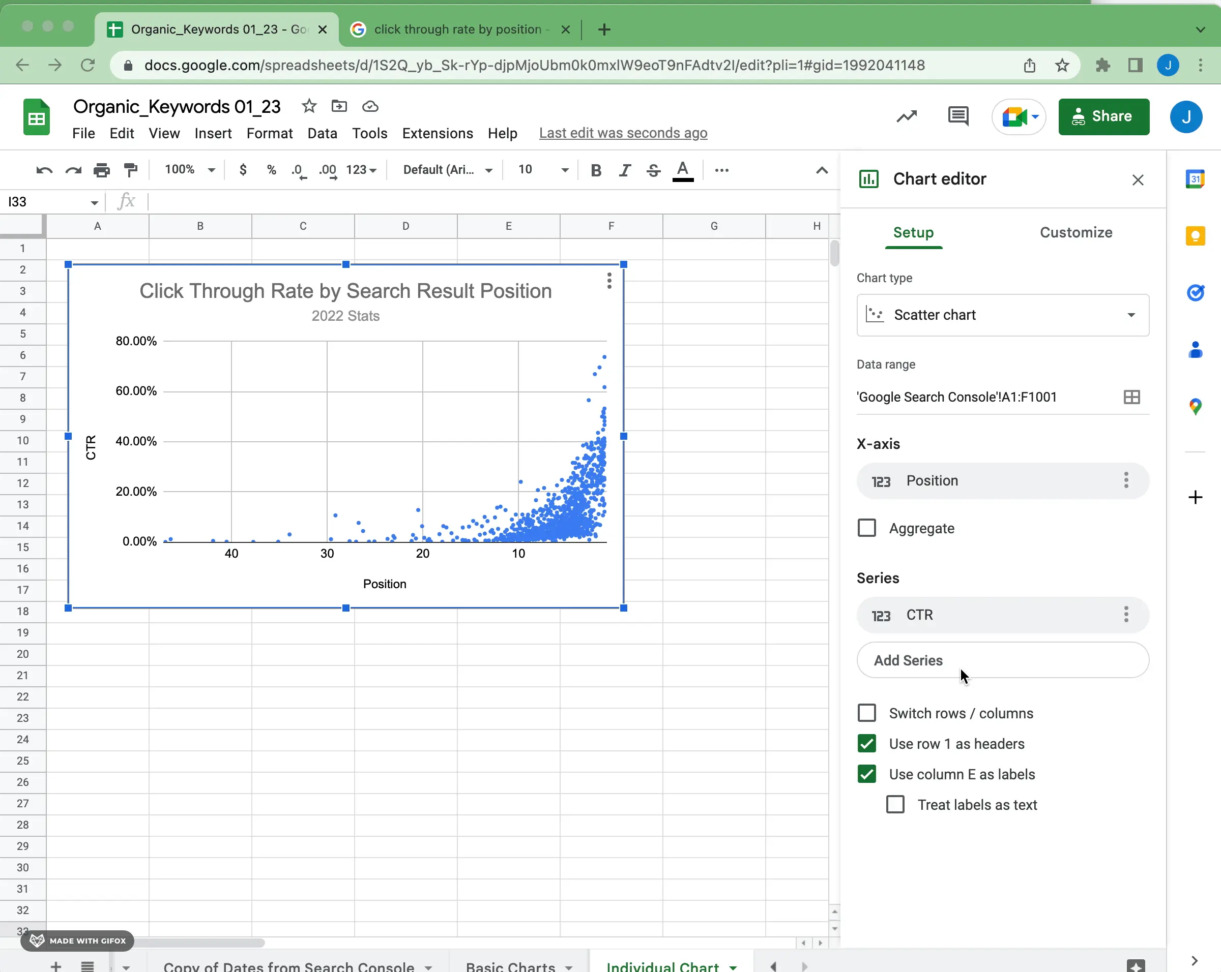
Google Sheets will attempt to interpret the data and auto-configure a chart, but you can change the configuration to a scatter plot after inserting the chart.
Scatter plots typically display two numerical measures, with one measure on each axis. You can choose to reverse the order of the axes to facilitate better comprehension of the visualization.
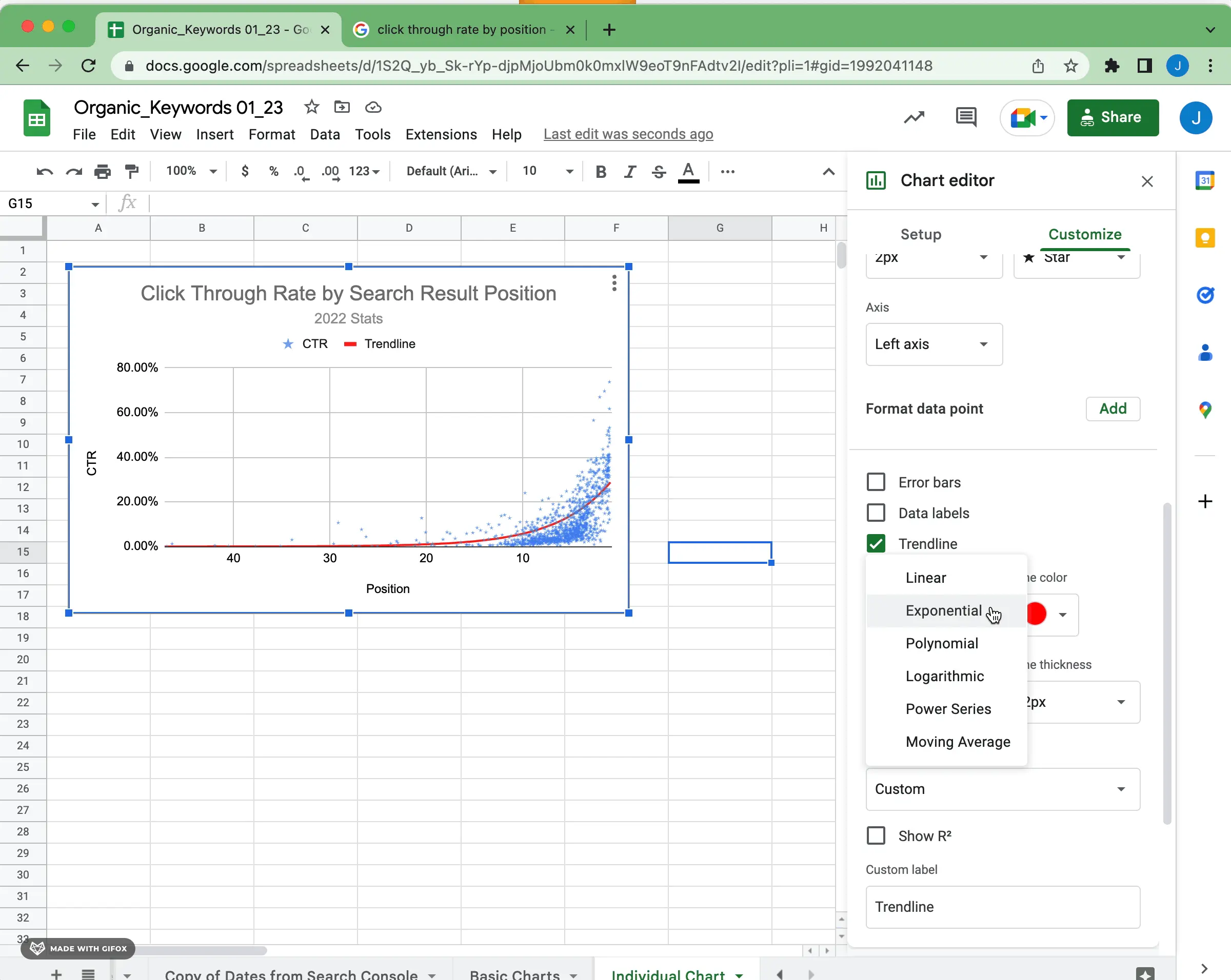
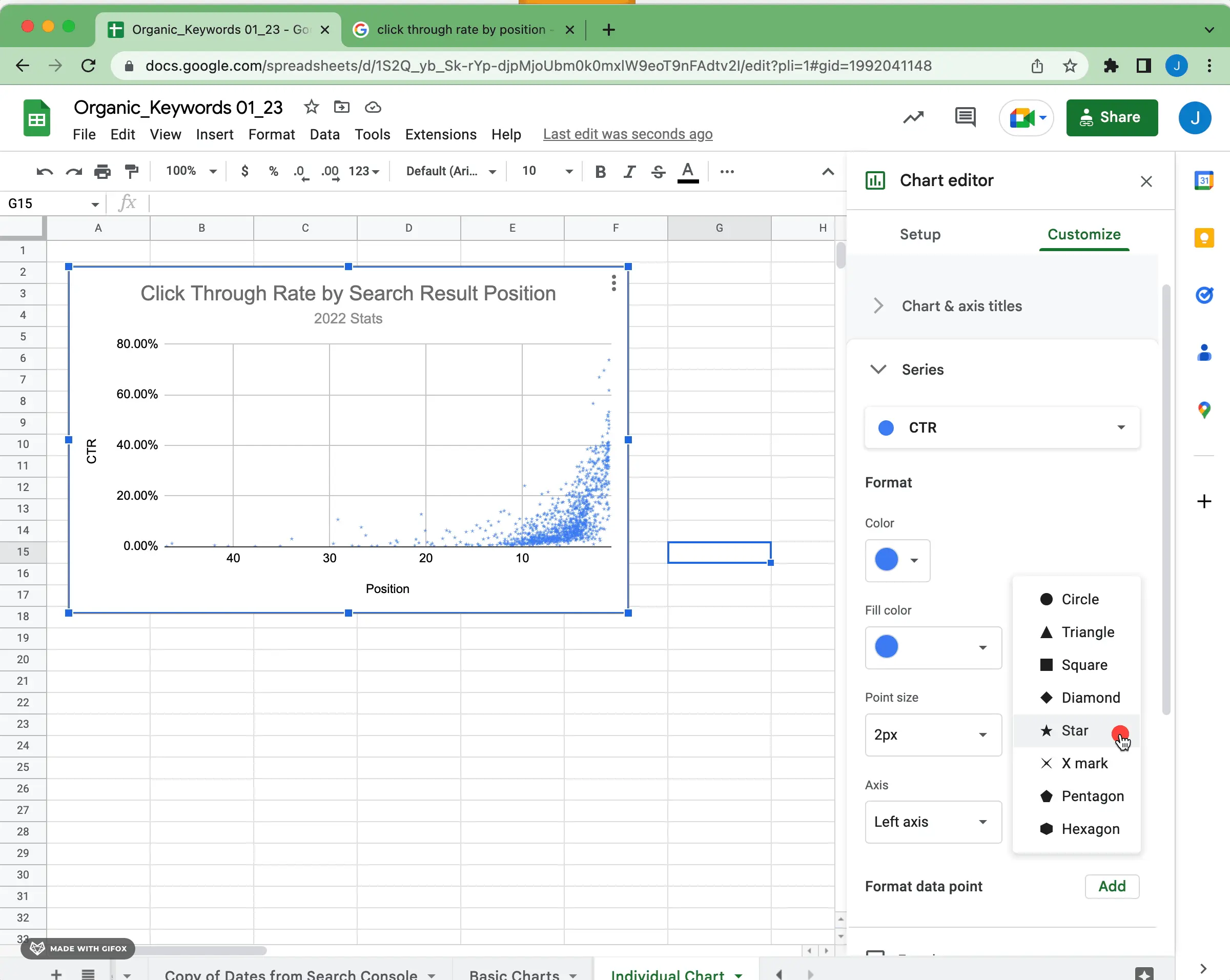
One of the keys to properly visualizing a scatter plot is choosing the appropriate size, shape, and opacity for each data point. If you have lots of data points, it may need some significant adjustments to make visual sense. For instance, changing the shape to a star and reducing the opacity slightly creates a different visual treatment for the data.
To understand how two numerical variables relate to each other, trend lines can be used in scatter plots. By drawing a trend line, you can identify if there is a correlation (positive or negative) between the two variables and the strength of that relationship. To draw a trend line in Google Sheets, select the data points and activate the appropriate tool for your chart type.
The software will generate a linear trend line as the default option. This is based on the assumption that the data is distributed linearly and helps analyze how slight changes in one variable may result in small changes in another. If you think that the data follows a different pattern, such as polynomials or exponentials, you can modify the trend line to match that pattern.
It is important to check for outliers to ensure that the trend line accurately represents the data. Outliers, which are values that deviate significantly from the majority of data, may indicate errors or anomalies that could affect the analysis results. Also, try to include enough data points in your chart to reflect the general behavior of the values rather than just one moment in time. Having more data points improves accuracy.
Remember to interpret the meaning of your trend lines. Although they help you see how two variables are related, it's essential to consider how these connections apply in real-world situations and how they might change over time. This will give you valuable insight into how specific trends can affect outcomes and guide your decision-making process in the future.
Now you know the basics of creating a scatter plot in Google Sheets.
If you're digging further into visualizing data and charting, check out our Google Sheets guide and other resources. If you want to use Airtable or Google Sheets data to create well-designed data visualizations, try out Superchart for free.


