

Google Sheets' pie charts are a great way to showcase how categories (or slices of the pie) contribute to a larger whole. Not only do they provide an efficient and dynamic visual representation of data, but since these charts take up less space than other visuals such as line graphs or bar charts, it is also convenient for displaying information on small screens!
When constructing pie charts for Google Sheets, make sure that none of the categories contain equal values; otherwise, your likely using the wrong visualization. Furthermore, keep the number of categories to a minimum so it's easier for observers to interpret and comprehend what is being displayed in the chart.
If you are wishing to craft some pie charts with Google Sheets, then adhering to these crucial configuration steps is a must:
Easily understandable and visually engaging, pie charts and doughnut charts are two of the go-to visualizations for data. Through these presentations, individuals can gain valuable insights into how various parts combine to form a complete picture.
Pie charts and doughnut charts are drawn differently, with the latter having an empty center which creates a donut-like hollow circle shape. This style allows for more data points to be visualized within the same area - making it especially valuable when dealing with vast sets of information.
Pie and doughnut charts differ in terms of how individual sections are highlighted. Pie charts emphasize the amount each segment occupies within a circle, whereas with doughnut graphs, emphasis is placed on the proximity between segments along its circumference.
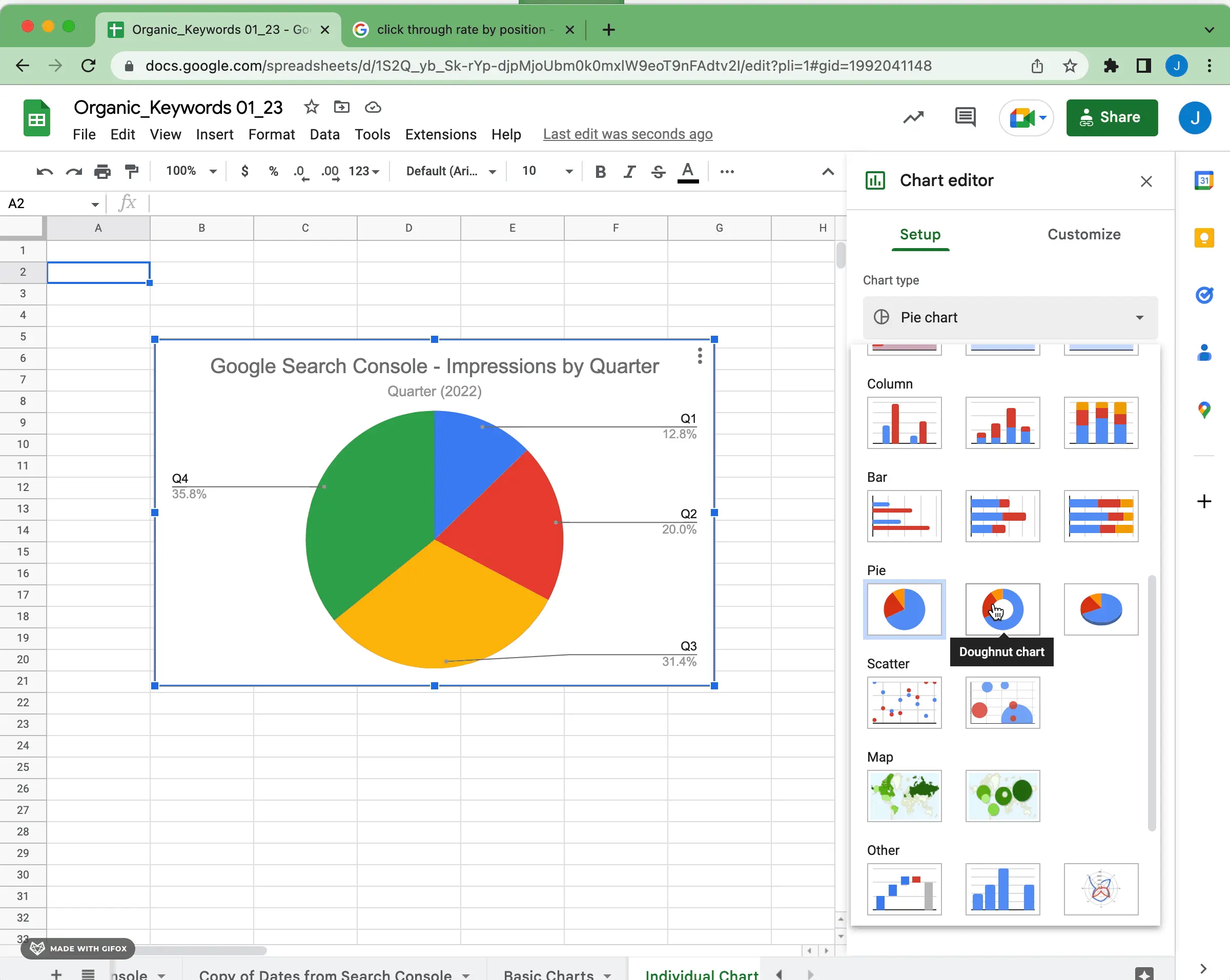
In the image below, you can see how you can flip between a pie chart and a doughnut chart in the setup. Experiment with the best way to visualize your data.
It all boils down to what message you are trying to share with your data when selecting the best type of graph. For example, if there is a lot of information that needs to be visualized and summarized into one space, then maybe choose a doughnut chart in place of a pie chart. If on the other hand you want viewers to see how each segment adds up proportionally or comparatively - select instead an illustrative pie chart as it will render these results more clearly.
To emphasize a particular section of the pie, you can easily separate it from the whole. Leverage labels and distance between your slice and center to create an impactful representation of your data.
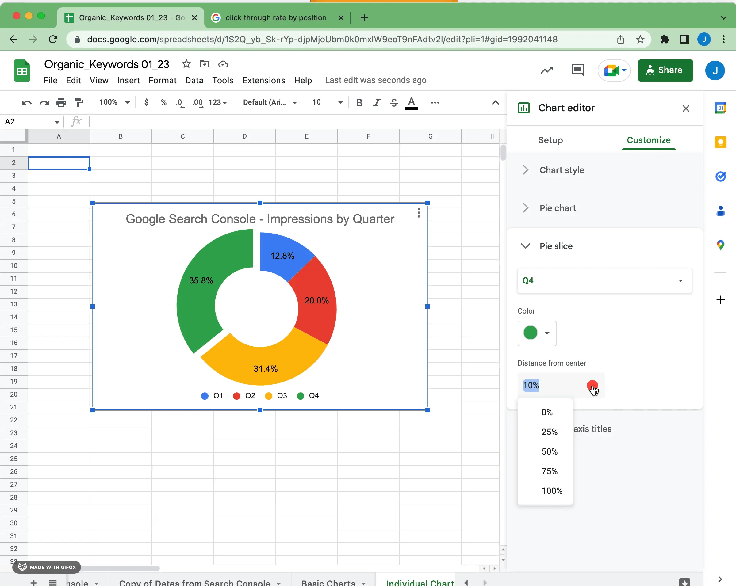
Once you start adjusting the distance from center for categories and other configurable elements, you'll get used to how much or how little might be appropriate depending on the data.
Pie charts are fairly simple in Google Sheets. Not every data set will fit or be best represented by a pie chart. Deciding between a pie or doughnut representations depends mostly on data complexity and preference. To see other potential visualization types, check out our starter guide for data visualization in Google Sheets and the visualization types available in Superchart.


