
Bar charts are the most frequently used data visualization. Bar charts are great visualizations to compare categories or groups within a data set. They can track how different variables, like changes in sales over time, interact with one another. There are different ways in which bar charts can be configured, including orientation (horizontal or vertical), use of colors, and various levels of data analysis.
A bar chart displays data with bars that run horizontally, while a column chart displays data with columns that run vertically. To begin creating a bar chart, follow these simple steps:
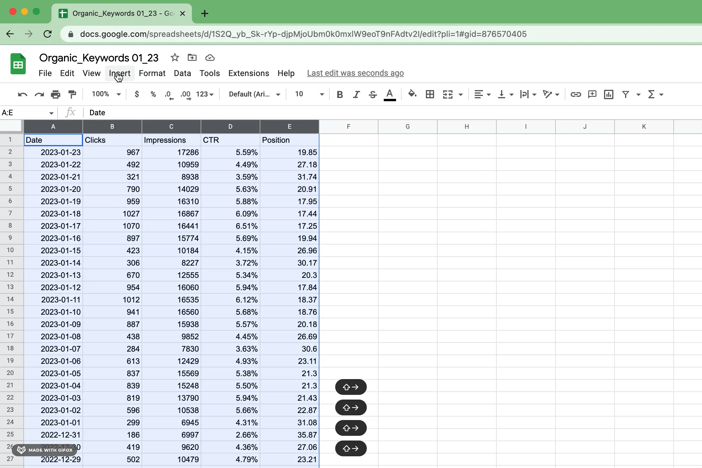
Select the data and insert a chart into Google Sheets, similar to the picture below. You can also select the data and right-click to insert a chart.
After inserting a chart in Google Sheets, you can modify the configuration to a bar chart even though Google Sheets will initially try to interpret the data and configure the chart itself.
Select the values for your y-axis and series. There are a lot of ways to configure a bar chart, but in general, you'll want categories as y-axis values and labels for your bars. As a general rule, use series to refer to aggregate measures or metric values that represent the summary data points you want to be displayed.
If you need to edit the data source, you can revisit the data range. Confirm the method of aggregation on each series (for example, average, sum, median). Also, double-check that the title, subtitle, and axis labels correctly describe the data, even after additional configuration changes.
As for chart customization, there are a lot of options. To get you going, here are some of the most important to configure for a bar chart.
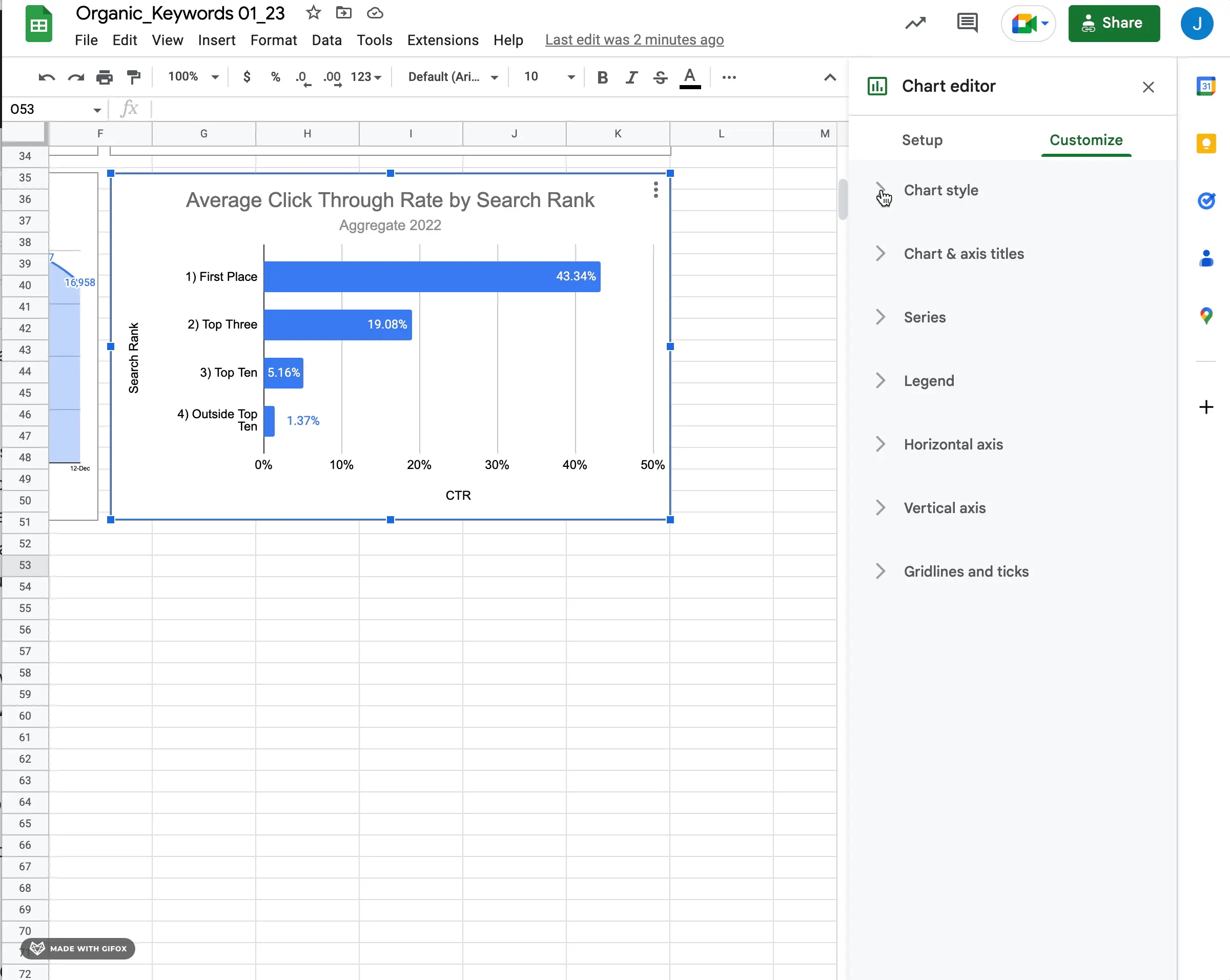
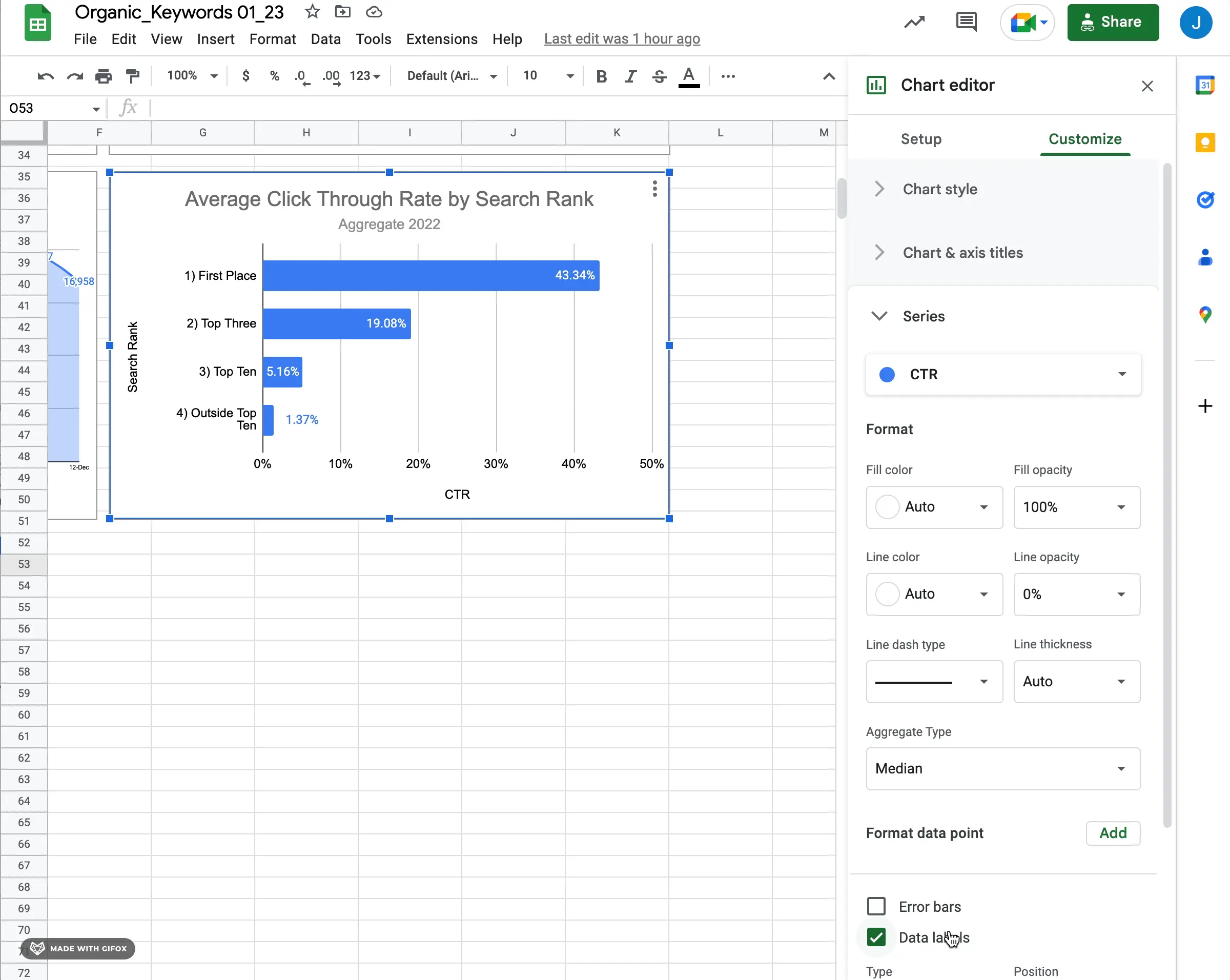
To make the bar chart easy to understand, the main title should give an overview of its content. The subtitle should provide extra context about how the chart was made, such as the type of aggregation used and the number of categories on the y-axis. Additional information on how each category contributes to the total can also be included in the subtitle.
You can use descriptive labels for axis titles. They will help the viewers understand how data values on each axis correspond with each other. For instance, label the y-axis as "Categories" and the x-axis as "Values" if you are plotting categories against values. If more than one metric is being visualized on one axis, use descriptive labels that accurately describe each category.
When creating a bar chart on Google Sheets, it is crucial to make the titles and axes descriptive but concise. This will help viewers grasp the data visualization promptly without feeling overwhelmed by jargon or excessive text. Use clear language whenever possible but ensure to provide enough detail for your readers to interpret your graph accurately. Additionally, centering titles might be a personal preference, but it's a common practice.

Adding data labels to bar charts is crucial as it allows viewers to easily comprehend the numerical value associated with each bar. Without them, depending on the scale of axis values, the audience may have to put in extra effort to determine the values themselves.
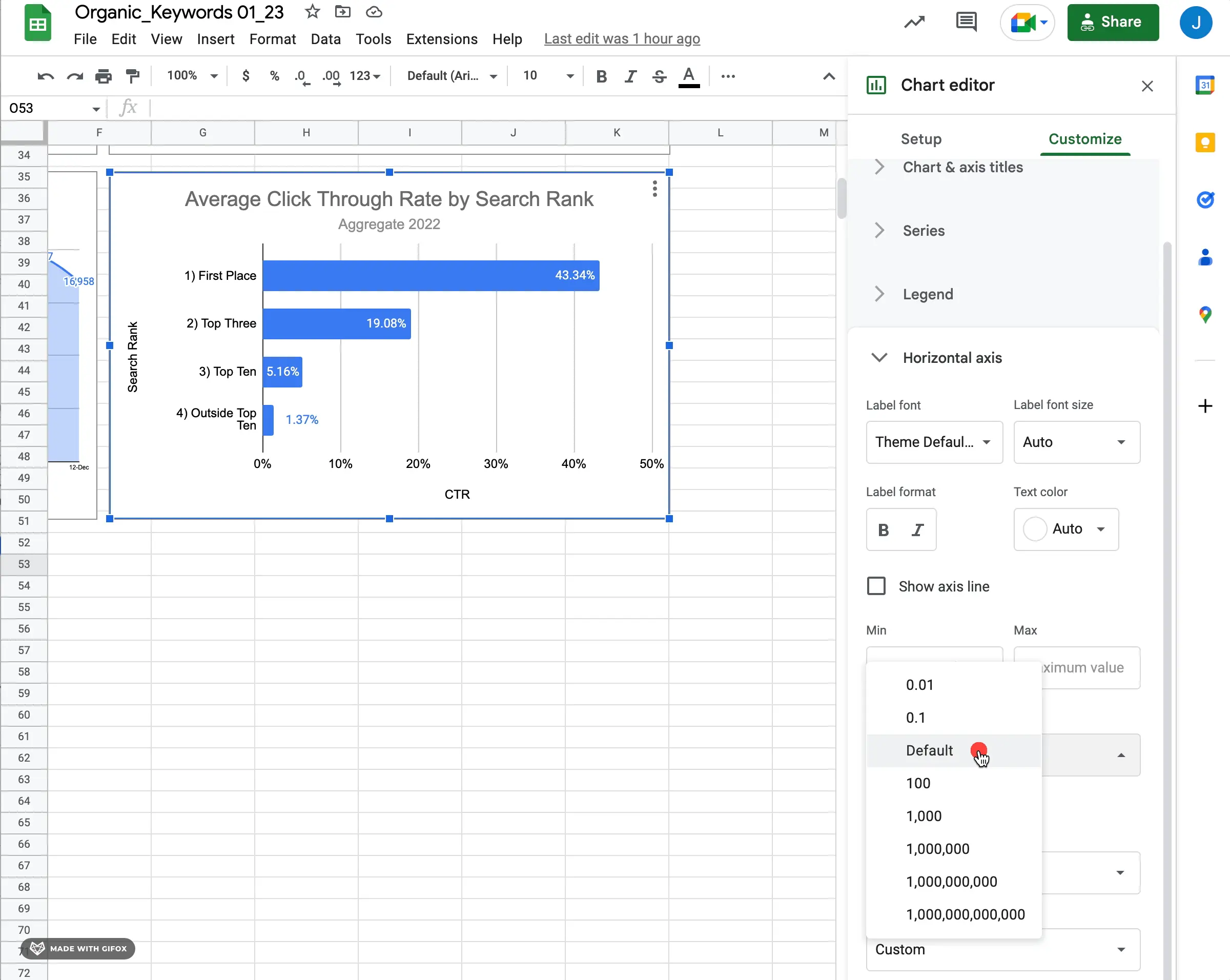
In Google Sheets, the scale factor determines how the values are displayed on a bar chart. By default, it is usually set accurately. However, if you want to modify the overall scale or adjust the display of the data, you need to know where to access the options to change these values.
You can create a functional and descriptive bar chart data visualization in Google Sheets by making sure you have the right underlying data, using clear titles, adding appropriate labels, and configuring it properly.
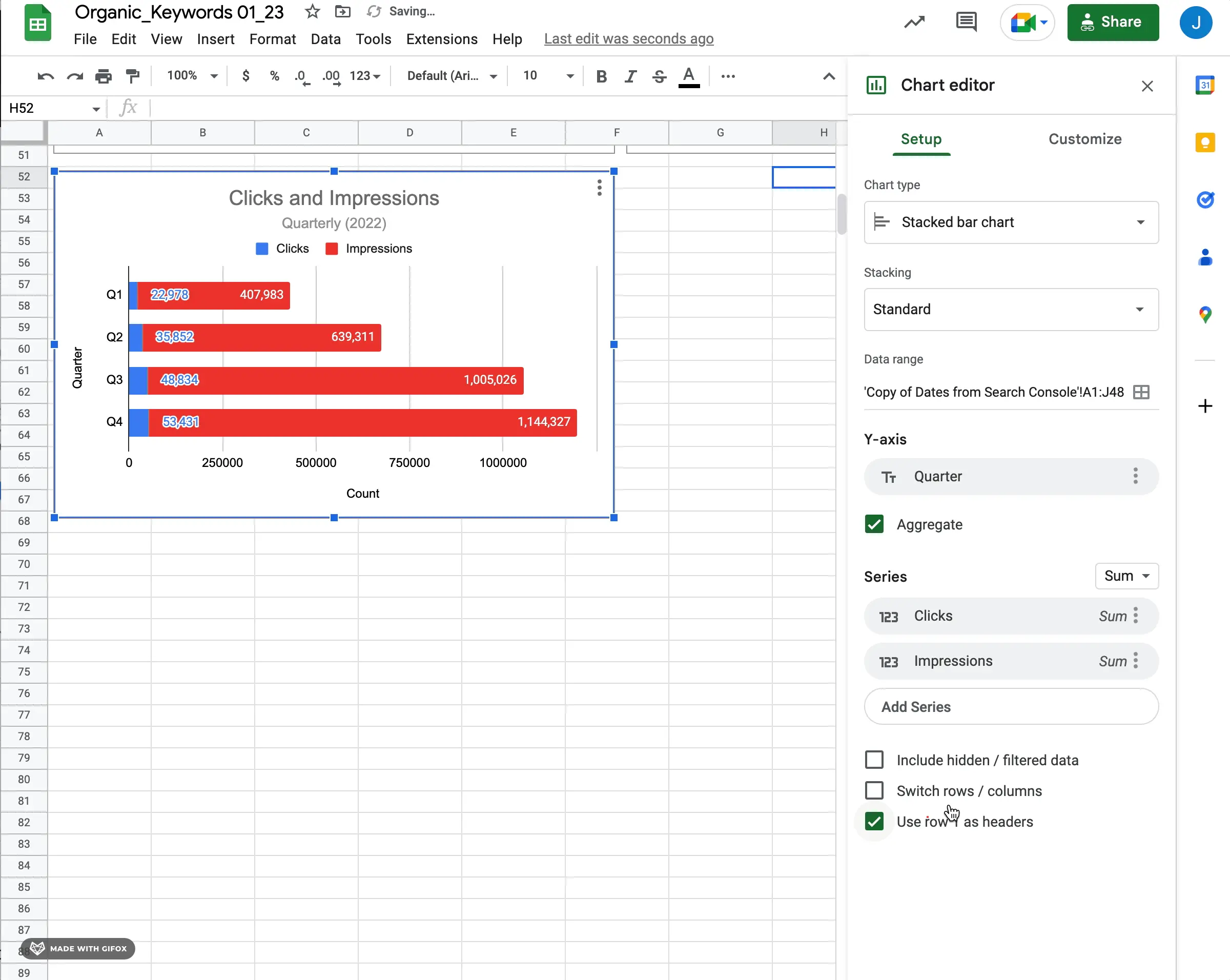
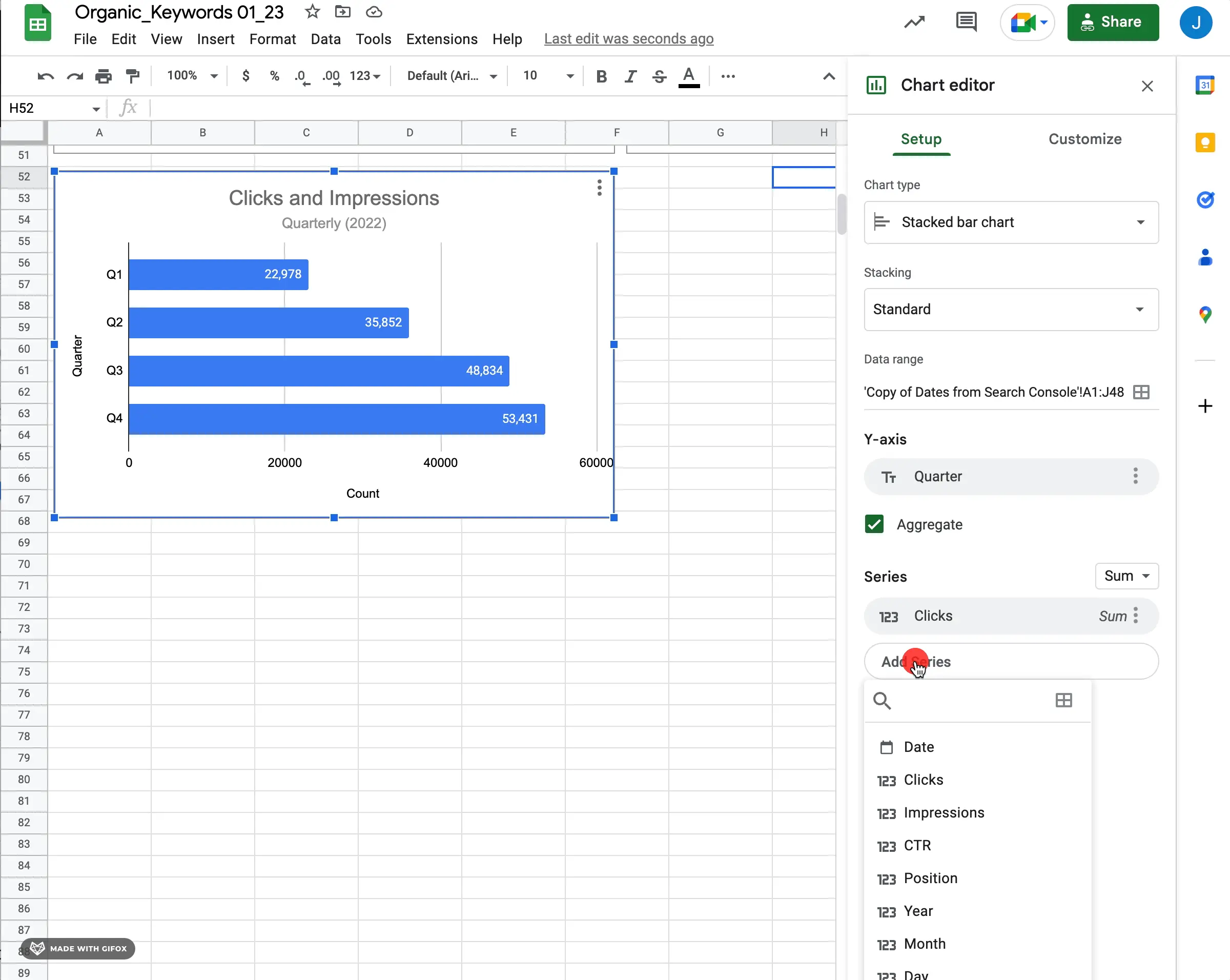
To simplify creating multiple bar charts in Google Sheets, consider using stacked bars. To create a basic stacked bar, use two series that share the same scale. While it's not mandatory that they have the same scale, beginning with this setup will help you understand how the stacked bar chart works.
Once you switch to the stacked bar chart type, you will be able to add multiple series to the bar chart configuration.
To display a stacked bar with customizable options for each series, select a second series. If you don't change the chart type before adding a second series, two separate bars will be shown instead of a stacked bar.
In my opinion, having data labels can help consumers better comprehend the data presented. This is based on personal preference.
Now you know the basics of creating a bar chart in Google Sheets.
If you're digging further into visualizing data and charting, check out our Google Sheets guide and other resources. If you want to use Airtable or Google Sheets data to create well-designed data visualizations, try out Superchart for free.


.png)